A new brand was acquired by Acesso in 2015, following nearly thirty years of operations in the São Paulo market. Tiago Rosa, a renowned graphic designer was asked to work on a suitable new visual language for the brand.
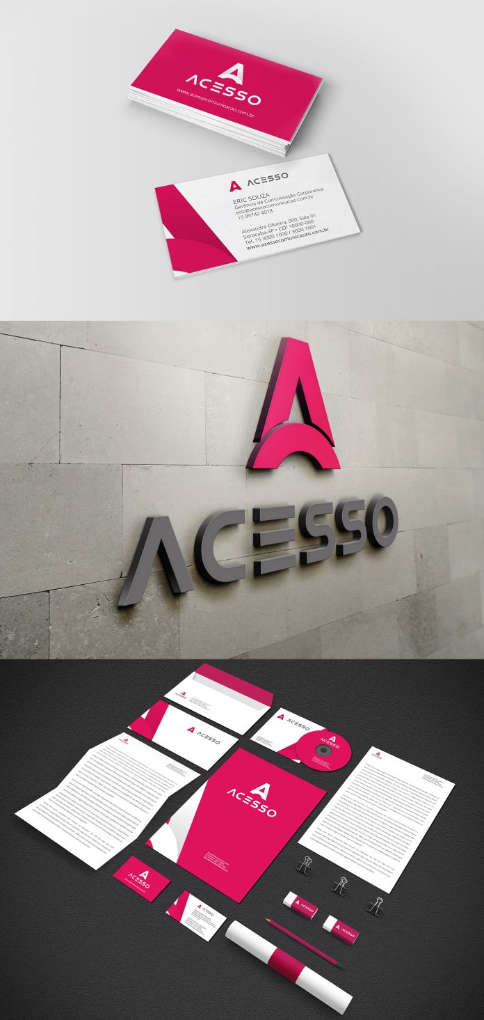
The proposal for the redesign aimed to strengthen Acesso’s brand positioning as a company specializing in internal communication. The emphasis was on building a bridge between the customer and their employees. To maintain the brand’s nearly 30-year-old tradition and visual principles, he retained the uppercase and minimalist font but increased the spacing between the letters. Together with his team, he also made a bold move by changing the color from purple to pink, which significantly enhanced the visual changes. Additionally, they introduced a symbol that reflects the new communication standard. The symbol is made up of the letters A and O from the word Access, forming a bridge between the first and last letters. The shape of the symbol also creates an upward-pointing arrow, which represents growth.
Below you can see some images of the new brand identity. You can see more of Tiago Rosa’s creative work on his and Behance .
All images © by Tiago Rosa. Do not hesitate to find more inspiring projects in the and categories.
Subscribe to our newsletter!
The post appeared first on .
Related Posts