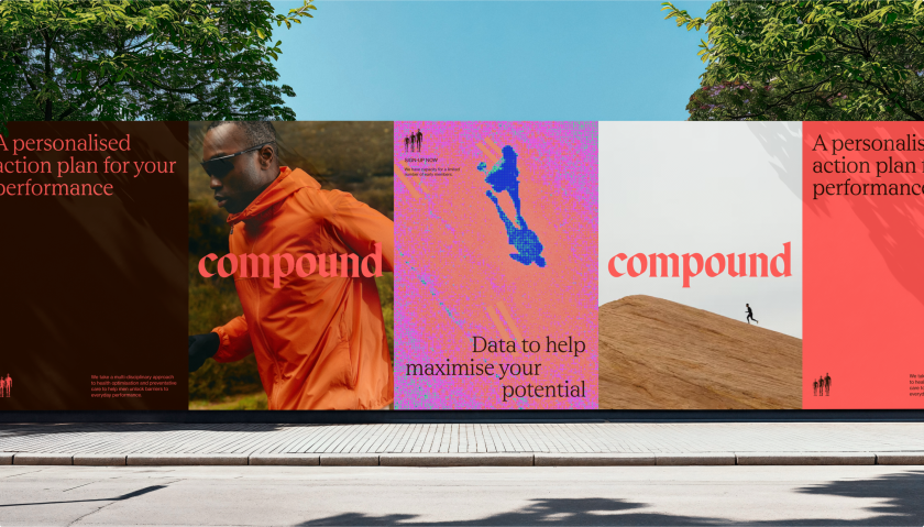
DesignStudio integrated a personalised touch into Compound’s identity to reflect how everyone’s health and fitness journey is different through the form of an adaptable, hand-drawn wordmark.
DesignStudio is behind the new identity for Compound, an integrated, personalised healthcare solution provided by Australian digital healthcare company Eucalyptus.
At its heart, Compound is a preventative healthcare and performance brand. Its USP is that it makes the tools, information, and support previously only available to elite athletes accessible to the average Joe.
Its offering comprises a mix of clinical diagnostics, diet planning, fitness programming, measurement and accountability, and its goal is to help clients meet their health and fitness goals.
The Compound team approached DesignStudio in late 2023, and after some initial chemistry meetings and discussions on the program of work, the studio was awarded the project.
The design team thought the brief was “absolutely fascinating” as Compound was “purposefully looking for an outside point of view and to build a brand with a distinct opinion,” according to DesignStudio APAC principal James Duru. However, the studio has worked around health, sports and performance for several years – from fitness startups to sports teams and entire leagues – Duru notes that Compund’s rigorous diagnostics and programming was new territory for them.

“A significant challenge any brand has in the performance and health sector is that wellness has become a catch-all term, with little accountability, so part of building Compound was to clearly communicate its difference and credibility”, he explains.
Naming the brand was in DesignStudio’s remit for this project, so the strategy and naming phases ran in parallel. The research covered everything from ancient mythology and stories of strength to mathematical formulae.
“Sometimes looking in very odd places reveals the most interesting outcome,” says Duru. Once the studio started to refine results and focus on the brand idea ‘To The Power Of’, a shortlist of names that clearly communicated the power of repetitive and cumulative positive actions was developed. From this, Duru says Compound emerged as “a firm favourite”, chosen for its feeling of “strength and solidity” and its ability to connect with “the strategic core of the program and brand”.
Gothic history, ancient codes of strength and futuristic visions are very different subject areas, yet the tension between them is “the core of Compound”, according to Duru. He believes these influences correlate with “the meshing of the time and dedication it takes to build positive health and fitness outcomes and the scientific inputs that help clients understand their health in new and powerful ways”.
“We feel there is an interesting space emerging in brand thinking where, for the right business, embracing a less uniform approach is an exciting opportunity to create distinction through character at each moment rather than corporate uniformity.”

Compound’s icon depicts three human forms, standing in a line, each slightly larger than the last, demonstrating how small incremental changes and efforts can create a lasting impact.
The brand’s image treatments are influenced by the diagnostics phase of the compound program, which involves blood work, athletic performance testing, dietary logs and a full body X-ray called a DEXA. “This internal scan is visualised as a colourful slice through your body where bones, organs and fats appear in bright blues, pinks, yellows and purples”, Duru explains, adding that “seeing it for the first time is both confronting and fascinating”.
To bring cohesion to the brand, DesignStudio used pixels with the same shape and angle as the brand icon and referenced the angles in the custom wordmark.
For typography, the studio used a custom blackletter logotype to further reinforce the old vs. new narrative. This style also resists the category trends for “smooth blandness in favour of memorable character”, says Duru.


Rhetorik and Neue Haas Grotesk do the heavy lifting in the brand system, where DesignStudio sought to balance aesthetic choices with Compound’s strategic and tactical needs. Duru adds that these types of choices are “authoritative and trustworthy” and work well across all touch points.
Another aspect that differentiates Compound is the ability to create a personalised version of the brand mark, which is all done by hand. “Through the process as a team, we discussed the idea of personalisation, handing the brand over and giving moments for our cohort to participate in co-creation,” says Duru, explaining how these personal marks reflect everyone’s different ambitions, struggles, successes, and outcomes.
“We felt an exciting and ownable way to signal this was to create a corner of the brand where clients could create their own marks for custom communications, limited edition merch or event events.”
Related Posts


