Creative agency Fluoro has created an impactful new identity for SWAMP, which reflects how the wildcard storytelling agency has grown from an indie start-up to an industry leader.
Brand experience agency , formerly known as Swamp Motel, has made a name for itself in the creative industry thanks to its fresh approach to storytelling. Its innovative work has already brought ideas to life for the likes of Warner Brothers, Prime Video and Deloitte, but now it’s the agency’s turn to be the centre of attention thanks to a rebrand courtesy of .
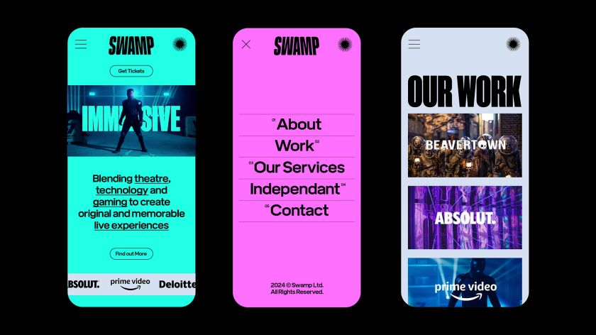
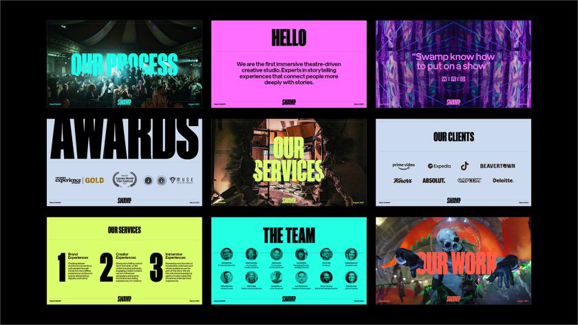
The new identity is a comprehensive refresh that sees it move away from its previous dark look. With the help of an unmissable colour palette, condensed name, and dynamic use of typographic design elements, the agency is now armed with a confident identity that’s better suited to its ever-rising status.
For SWAMP, Fluoro was the obvious choice for conducting the rebrand. Having previously worked together on a project for Absolut, the agency was confident that Fluoro would effectively capture its approach and work ethic.
But this wasn’t a rebrand for the sake of one. SWAMP’s business offer and client base had outgrown its old eerie aesthetic, so Fluoro was briefed to make something less limiting. “Their founders and team felt it was time for a fresh and comprehensive brand identity and design system that more accurately reflected their vision,” says Fluoro production manager Marie Sullivan.
“Through a unique and unconventional approach, SWAMP has gone from an indie start-up to an industry leader, and they felt they needed an identity that accurately positioned them as both disrupters and pioneers.”
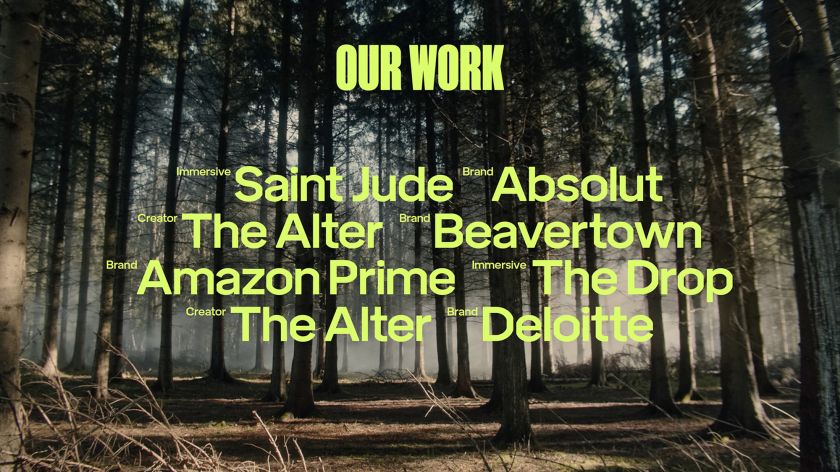
At the heart of their offering was to help reposition SWAMP as the “wildcards” of storytelling experiences. This was ultimately achieved thanks to the use of brand assets that “clearly didn’t want to fit in.”
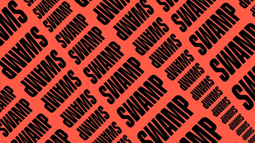
Marie adds: “The ‘wildcard’ idea came from their bravery in pushing innovative, reality-distorting experiences. The logotype is angled away from the viewer to add drama and gravitas by making you feel like you are looking up at an imposing structure.”
Even the slightest of tweaks to an existing brand can face monumental hurdles, so an overhaul like this was not without its challenges. The biggest one facing the Fluoro team was bringing together the desire to appear arthouse and experimental while being big and commercial enough to appeal to various brand audiences.
“We also brought this contradiction into the identity elements – for example, the gravitas of the logotype was contrasted with some soft, rounded corners that connected the letterforms more visually and made the type feel more friendly,” Marie explains.
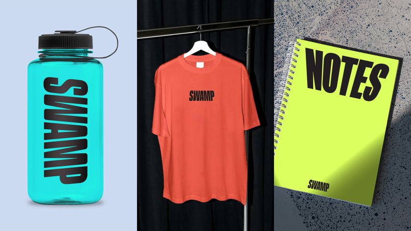
Another problem that Fluoro had to fix was the disconnect between the original Swamp Motel brand feeling and the brilliant work that the company produced. “We, therefore, created a system where the identity playfully interacts and integrates within the live performance and theatrical visuals so that the brand becomes part of the action,” Marie adds.
Rounding off the successful rebrand are snappy soundbites and video elements that echo SWAMP’s reality-distorting experiences. Working in harmony with the electric neon graphics and impactful SWAMP logo, the whole package helps the agency stand out in a suitably theatrical way.
“Fluoro helped us see the opportunity in our visual presence,” says Clem Garrity, co-founder & exec creative director, SWAMP. “With our portfolio and growing reputation, they encouraged us to be even more ambitious with our design goals, and the result is fantastic.”


Related Posts