A rebrand for the world’s biggest music contest has landed, but it’s not the usual big-name agency behind it.
The Eurovision Song Contest has revealed a refreshed global identity for its 70th anniversary, and it’s a far cry from the cookie-cutter rebrands often seen at this scale. Unveiled by the European Broadcasting Union (EBU), the update marks the first major evolution of the brand in a decade, introducing a new logo, typeface, and design system built for digital clarity and global consistency.
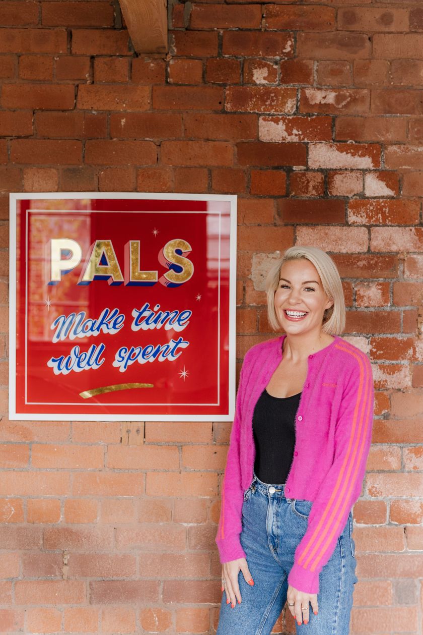
Surprisingly, the project wasn’t delivered by a huge network agency. Instead, it was led by Amy Bedford, founder of Sheffield-based PALS, working with a handpicked team of more than 20 freelancers from around the world.
Amy, who previously led the BBC’s 2023 Eurovision brand strategy and coined the now-familiar “United by Music” proposition, saw this as a chance to rethink what a world-class creative process could look like, especially outside of London.
“This is proof you don’t need to be a global network to deliver world-class branding,” says Amy. “The current wave of redundancies shows the big agency model is broken – there’s too much mediocre resource delivering expensive, mediocre work. With a smaller, agile model, you get sharper thinking, faster decisions, and better results.”
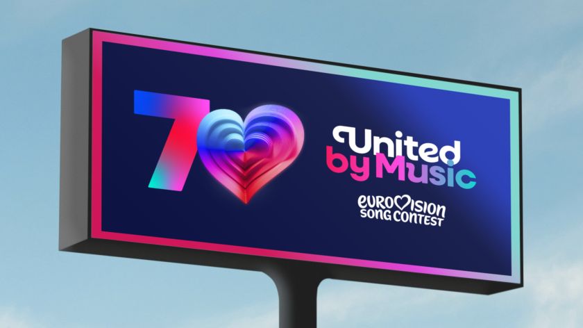
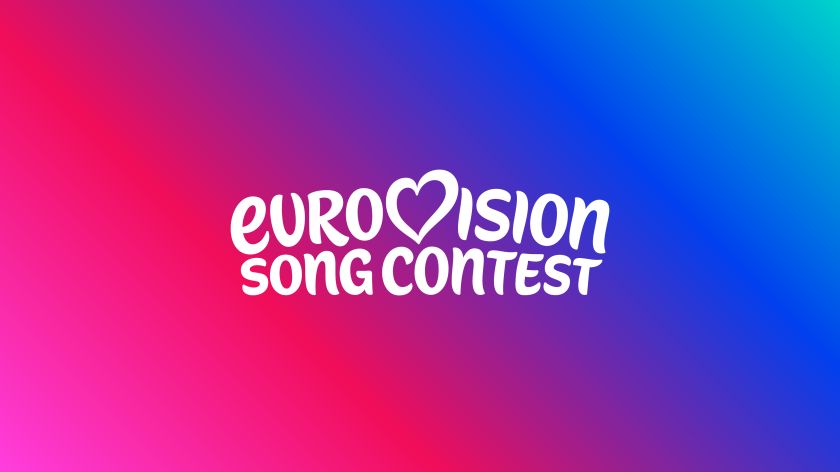
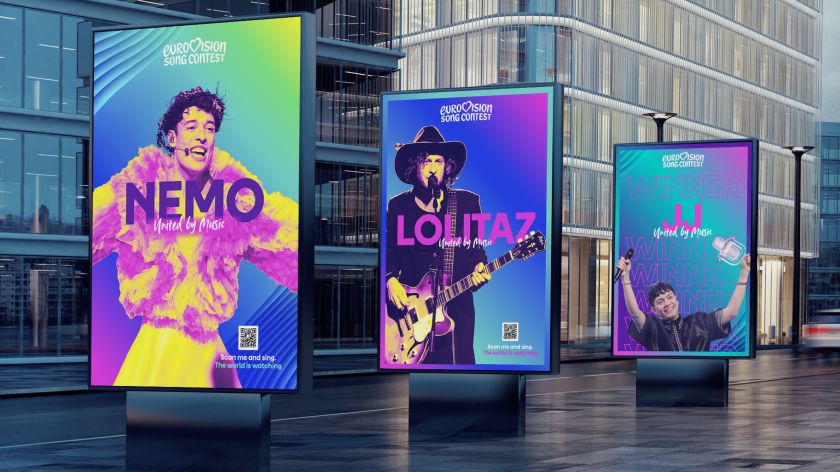
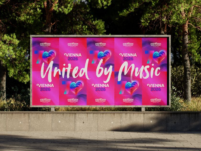
The reimagined Eurovision logo retains the famous handwritten wordmark but refines it into a unified, bespoke marque. While the familiar heart icon remains centre stage, it now serves as the foundation for a flexible, digital-first design system that can shift in style, colour, and movement, adapting to host nations, campaign themes, or artist identities without losing its core Eurovision DNA.
A new typeface, Singing Sans, replaces the previously used Gotham, providing the brand with a distinct typographic voice and optional embellishments for added flair. The system is rounded out with an extensive digital asset library, an inclusive colour palette, and defined brand behaviours.
Amy describes it as a “living, breathing brand system”, with the refreshed heart – nicknamed the Chameleon Heart – capable of absorbing cultural cues and musical energy in real time. For the anniversary year, the logo animates in 3D with 70 layered forms, each representing a year in the history of Eurovision.
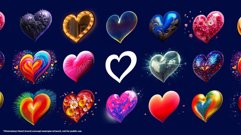
The refresh arrives at a time when the Eurovision Song Contest’s global reach is greater than ever. In 2025 alone, the contest’s official platforms generated over 2 billion digital impressions. With that scale in mind, the brand had to work just as well on a smartphone screen as it does on a stadium stage.
According to Martin Green CBE, director of the Eurovision Song Contest, the new identity is about both honouring the past and future-proofing the brand. He says: “This refresh honours 70 amazing years while taking the brand forward to an exciting future. It’s bold, playful, and full of heart – just like the Contest itself.”
He added that the updated design would help unify Eurovision’s growing family of projects under a single visual language, while also strengthening trademark protection and consistency across markets.
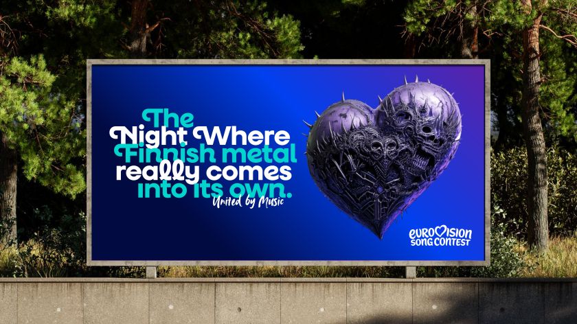
For Amy, the project was also a statement about creative possibilities beyond the usual capitals. “Sheffield is notoriously bad at promoting itself,” she says. “I’d love this project to invite a spotlight onto regional talent and show that world-class creative work isn’t limited to the capital.”
Working remotely from South Yorkshire, she assembled a global team of typographers, 3D artists, motion designers, and strategists – including one of the world’s leading logo designers – to create something that could evolve with the contest.
“Only halfway into the project did I realise Eurovision has more viewers than the Super Bowl,” she jokes. “But being small meant I could build incredibly close relationships with the EBU team, which made the collaboration stronger.”
The new identity will begin rolling out across Eurovision platforms, events, and campaigns over the coming months, ahead of the 70th Contest in Vienna, Austria.

Related Posts