A quarter of a century has passed since the inaugural Dulux Colour Forecast, and 25 years later, the paint luminaries remain at the apex of up-to-the-minute colour palettes.
While the two previous renditions were heavily influenced by the pandemic and subsequent lockdowns, this year is a clear pivot away from the melancholy associated with those challenging times, embracing a nostalgic influence. Golds, greens and reddy browns lay the foundation for the three palettes – Solstice, Journey and Muse – with each able to appeal to a wide range of consumers.
Dulux’s Colour and Communications Manager, Andrea Lucena-Orr, composes the palette alongside Colour Forecaster and Stylist Bree Leech and Colour Manager Lauren Treloar. Lucena-Orr says each year is influenced by similar factors, with each outcome entirely different.


“Just like in previous years, our analysis considers several factors. We examine macro trends, including political events, potential natural disasters, consumer sentiment, financial developments, and technological innovations,” Lucena-Orr says.
“These elements play a significant role. Additionally, we observe micro trends, such as media sensations like Barbie or the focus on sustainability, which might involve eco-friendly materials like timber or stone.
“All these factors contribute to our understanding of colour’s trajectory. To confirm our predictions, we attended Milan Design Week, where our expectations about colour were validated. Subsequently, we saw even more examples aligning with our projections.”


When citing the differences between 2024 and its predecessors, Lucena-Orr believes it was a natural transition to understated, yet assured midtones.
“I believe it’s about the evolution of colour. In the past, we were more focused on vibrant and pastel shades, but now we’re gravitating towards midtones. This means the colours are less bright and more subdued, allowing them to recede into the background,” she says.
“Although there’s still an abundance of colour, the intensity has shifted. This transformation is consistent with the gradual nature of colour trends in the fashion industry.”


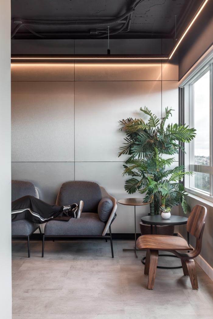
Striking a balance between Scandinavian typology, Mediterranean influence and the desert sun, Dulux Solstice comprises a palette of rich browns, clay and warm neutrals with a sun loving yellow as an accent, designed to evoke a comforting, familiar and inviting feeling. Regarded as a “palette of nurturing hues” by Lucena-Orr, softer shades of pastel blues and citrus yellow create safe, inviting visuals.
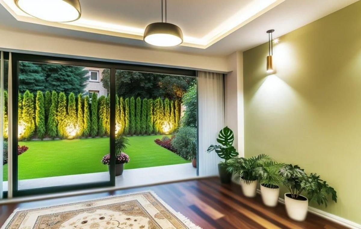
Journey is a tribute to the art of storytelling, with depth and colour providing a suitable backdrop to modern chic. Rich mid-tone hues and yellow green lie at the heart of the palette, juxtaposed alongside rich decadent reds and dusty blues.


The Dulux Muse palette draws inspiration from the postmodern era, particularly the 70s, to revitalise the free-spirited styles of that time. Vintage elements characterise much of the palette, featuring warm browns, rich tans, deep blues, and soothing greens, blending modernity with 60s-80s references and 70s textures for a distinctive modern interior that pays homage to design icons of the past.
Colour Forecaster and Stylist, Bree Leech, adds that the Muse palette is a trend that strikes the perfect balance between nostalgia and modernity. “The sophisticated palette results in spaces that are timeless and simultaneously modern, that pays tribute to the design icons that have come before us,” she says.


While Dulux simply provides the foundation for the use of colour in 2024 and beyond, it is ultimately the architects, interior designers and homeowners that adopt the palettes to their own liking. As to what comes next, Lucena-Orr says the palettes can easily be used on all four walls, or simply introduced via the implementation of one or two.
“Anticipate a resurgence of colour, particularly due to the prevalence of muted shades this year,” she says.
“These subdued tones are more user-friendly and appeal to a wider audience. Generally, Australia is embracing more colourful palettes, shifting away from the dominance of grey towards a brown-themed period. With this transition, a sense of calmness is also on the rise.”


To view the palettes in full, . You can also scroll through the highlights from Dulux’s colour forecast presentation, which saw key design media and leading designers gather together to share breakfast and immerse themselves in Dulux’s exciting new colour directions, at the NGV in Melbourne.
Dulux Colour Forecast 2024


We think you might like this article about the colourful ceramic tile collections of .
The post appeared first on .
Related Posts