Connectivity and collaboration are key principles within the Ridley Scott Creative Group, and they are now reflected in RSA’s bespoke and contemporary wordmark.
Hingston Studio is behind Ridley Scott Associates’ (RSA) new identity, which aptly communicates its offering through animation and features a new bespoke wordmark.
Having previously worked with Ridley Scott Creative Group and knowing the founder and managing partners for some time, Hingston Studios was a natural choice when deciding who should partner with RSA for the brand refresh. According to creative director and founder Tom Hingston, his design team already had “a very clear understanding of the business, its objectives and their collective vision”.
Ridley Scott Creative Group CEO Luke Scott reveals that the change responds to “the ever-evolving demands of the creative industry”. The film production company commissioned Hingston Studio to create a contemporary and cohesive identity that could be applied clearly across the different divisions of RSA.
One of the primary aims was to “future-proof the brand image”, says Scott, using an evolutionary visual language designed to communicate RSA’s principles and purpose.

Hingston agrees that, in light of recent years of expansion within the Ridley Scott Creative Group, the company had an opportunity to “recalibrate and distil the essence of the RSA Films brand to define its voice and purpose for the next chapter”. However, the studio had to consider the unprecedented changes happening across the visual communication landscape and reimagine the brand with a “necessitated careful balance”, he adds.
One of RSA’s most obvious needs was a new orientation with a digital-first focus. Hingston describes the result as “bold and flexible, yet timeless” and explains how it instils “the values of craft, excellence and the humanist qualities synonymous with the RSA name”.
A beautiful, animated bird formed the central motif in RSA’s previous identity, but in Hingston’s view, its delicate features were not suited to the brand’s ever-evolving digital space. Instead, the studio set out to establish a brand mark that would be both immediately recognisable and evoke notions of connectivity.
RSA’s new bespoke wordmark – a contemporary, sans serif ligature that unifies the three letters – does exactly that. In addition to being able to perform seamlessly at scale in digital and physical environments, it firmly establishes the notion of collaboration and connection within the group.
As Ridley Scott Creative Group currently has multiple subsidiaries, Hingston Studio was challenged to unify its new brand architecture by establishing a clear hierarchy that delineates the activities of the holding group with those of its individual entities.
The solution was a typographic framework that ties each of the four subsidiaries to the main RSA brand. For the sake of clarity and coherence, the studio opted for Helvetica Now as the secondary font, which appears in a single size and weight throughout the system.
“This simple framework will serve as a long-term attribute as the organisation and its associated entities continue to evolve into the next decade and beyond,” says Hingston.
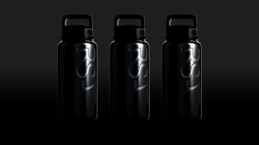
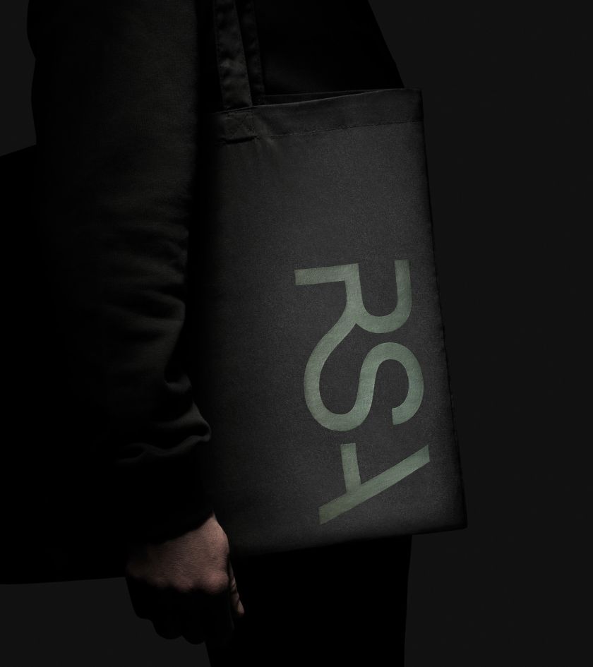
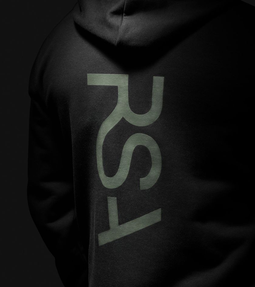
When it came to animation, it was crucial that the studio reflected RSA’s craft of storytelling, which has been at the very heart of the business for over 50 years. Animated behaviour formed a central part of its new brand, says Hingston, but even more importantly, RSA needed an identity that could be “adapted and re-interpreted over time”.
Because the company produces all forms of content – from features, documentaries, and commercials to music videos and stills photography – Hingston Studio had to construct a mark robust enough to flex in its animated appearance. Whether it’s colourful, mono, polished, grainy, or analogue, Hingston explains how the RSA mark’s materiality and colour are “always contextual and responsive to the varying image content that the brand is coupled with”.
Related Posts