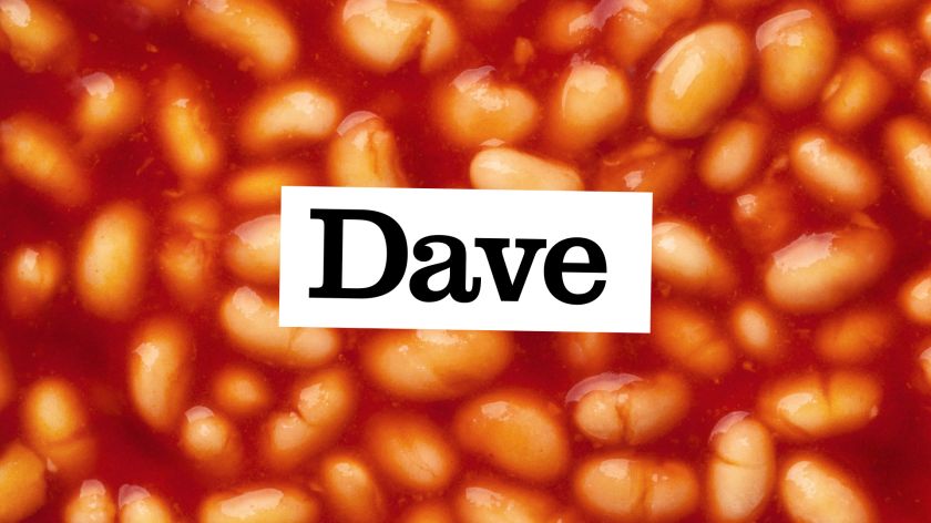
London branding studio has embraced the messiness and humour of life in its new visual identity for TV channel Dave. Here the team share how they achieved this by undermining the perceived wisdom of branding itself.
Originally conceived as the first “broadcast disruptor”, the UK entertainment channel Dave has evolved into a home of original and exclusive comedy, including the likes of Late Night Mash and Hypothetical. This is a far cry from the repeats of Top Gear that made up the bulk of the channel’s output when it was set up, so there was a strong need for Dave to have a new identity that was more up-to-date with its content.
Longtime viewers of Dave might recall the previous identity, which lent itself well to the channel’s early content. There was an air of gentrified charm about the aesthetic. Slick one-liners, dapper imagery and a gentlemanly air, were the order of the day. And while comedy is still at the core of what Dave delivers, Output turned its identity on its head by embracing the chaos.
By digging into the essence of what Dave is as a channel, Output strove to create an irreverent and playful identity, all while shaking up the conventions of linear TV and future-proofing the brand for years to come. No small feat.
Fortunately for Output, Dave is built around mantras that provide the basis of its new identity. These include the belief that “humour is a damn good antidote to the awkward mess that is modern life” and that the silly joy of everyday life is brimming with opportunities for people to “find the funny”, whether through authentic observations or relatable moments.
“The UKTV team asked us to look at Dave with a fresh perspective,” expands Johanna Drewe, Output’s Creative Director & Partner. “They needed the firepower to reimagine the brand and meet their new strategic direction and evolved progressive content. We set out to redefine broadcast into unfiltered conversations, creating a brand which disregards conventions and embraces the humour and joy in the messiness of our daily lives.”
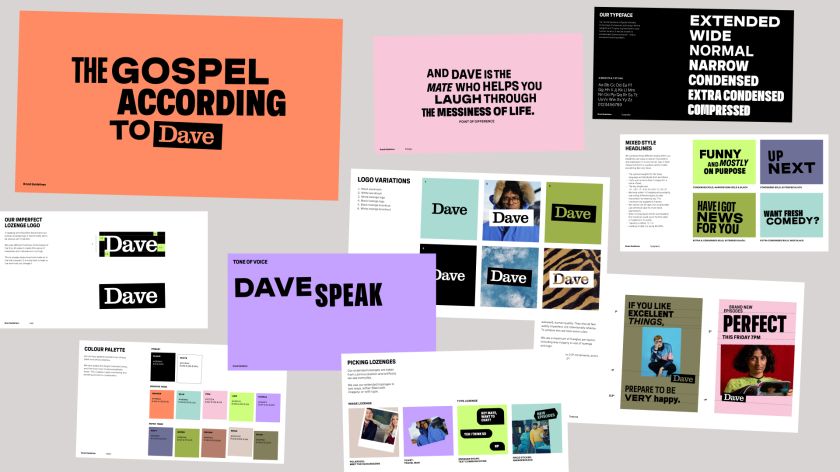
This fresh perspective saw the Output creatives deliberately shun the slick graphics of conventional TV branding. Instead, they wanted to focus on mistakes, frailty, and flaws. After all, these are the places humour often resides in real life.
This approach also gave Output room for manoeuvre as the brand could swerve from deadpan wit to surreal silliness depending on the programme. A loose system was devised to hold the overall brand together while also allowing it to stay fresh and reactive.
“Meeting the Dave team, we knew instantly that the brand had to feel irreverent and unpolished,” reveals Mark Robbins, Output’s Brand Design Director. “The challenge was creating this almost human, imperfect aesthetic in a way that would work for broadcast and be able to be executed really quickly for reactive content daily too.
“We had to ditch design sensibilities and embrace making everything feel a little bit awkward and intentionally flawed. The outcome hopefully feels like a total disregard for TV channel branding rules and conventions. It should feel fun and silly, encapsulating Dave’s outlook, not taking themselves too seriously and always finding the funny in daily life.”
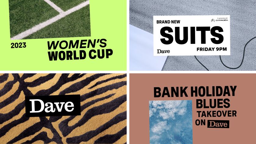
In terms of motion graphics, these borrow from everyday movements such as bread popping out of a toaster or a piece of paper awkwardly emerging lopsided from a printer. This is a prime example of how Output’s anti-brand finds the funny in the regular world, and thanks to being applied on social media and out-of-home assets, they help to take Dave even further than the TV screen on your living room wall.
Like the punchline to a good joke or an effective meme template, the new brand can stay topical while remaining distinctly Dave. In fact, thanks to its in-built scope, the variety of assets at Dave’s disposal mean it is better suited than most when it comes to adapting to change or public conversation.
The rebrand isn’t complete yet, either. Despite launching across all platforms last year, the identity has been specially designed so that channel owners UKTV can constantly add their own ideas and expand Dave’s visual toolkit.
“Output understood the brief from the get-go and continued to challenge us throughout the process,” concludes Peter Allinson, UKTV’s Head of Design. “Offering plenty of innovative ideas and executions along the way, each with a clear, holistic approach. They helped us take the smart, comic Dave tone of voice and apply it to the biggest canvas of all: everyday life. Allowing us to really resonate as a brand and insert Dave into the world of our viewers.
“Dave’s fresh new look and design language also helped to open up the ‘world’ of Dave – from the telly and YouTube to Podcasts and TikToks. It’s a new dawn; it’s a new Dave!”
Related Posts