, the design agency that creates brand identities for “ambitious people with a mission”, has given financial service a confident new look, positioning it as a competitive influence alongside the ‘Big Four’ banks.
Banking can be a difficult sector to visualise, let alone make it relatable. It’s competitive, fast-paced, and often involves services that are abstract and hard to bring to life. That’s why ClearBank appointed Output to give it a new identity, reflecting its position as the UK’s fastest-growing tech company.
What made things even more difficult for Output is that ClearBank is a unique business even within the banking world. The company is the UK’s first new clearing bank in 250 years, and what’s more, it’s a purpose-built, tech-enabled bank at that. Having evolved from its startup origins in 2017 and moved into profit in 2022, the time had come for ClearBank to present itself in an appropriately pioneering fashion.
To do this, ClearBank and Output settled on the visual language of ‘powerful collaboration’. This language aims to give ClearBank the “confidence and clarity that matches their ambition”, as well as unite its direction and instil it with a sense of pride.
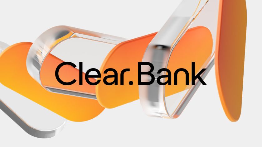
‘Powerful collaboration’ can be seen all through the new identity, from the mathematically-optimised wordmark, customised brand typeface, and spacious layouts, which combine with the natural photography of the ClearBank team to create a refreshing sense of clarity.
“One of the biggest challenges was distilling what is largely seen as a functional utility and a complex product offering, and turning it into what could be a really elegant and distinct language, then delivering it in a really simple, confident and clear way across the whole brand,” says Mark Robbins, Output’s brand design director.
“The energy and pride of the people at ClearBank have got them where they are today, so the new brand captures their vision of ClearBank, and propels them to be a globally recognised financial partner.”
Sam Hodges, the digital design director at Output, adds: “Our goal was to make ClearBank’s offering as clear and understandable as possible to potential clients, completely reviewing how ClearBank packaged their service. As a company, ClearBank sits between technology and service, so we took cues from both worlds as we developed its messaging.
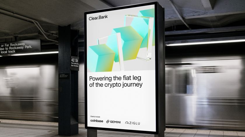
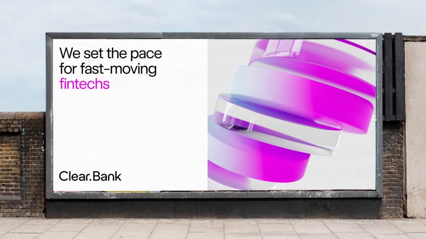
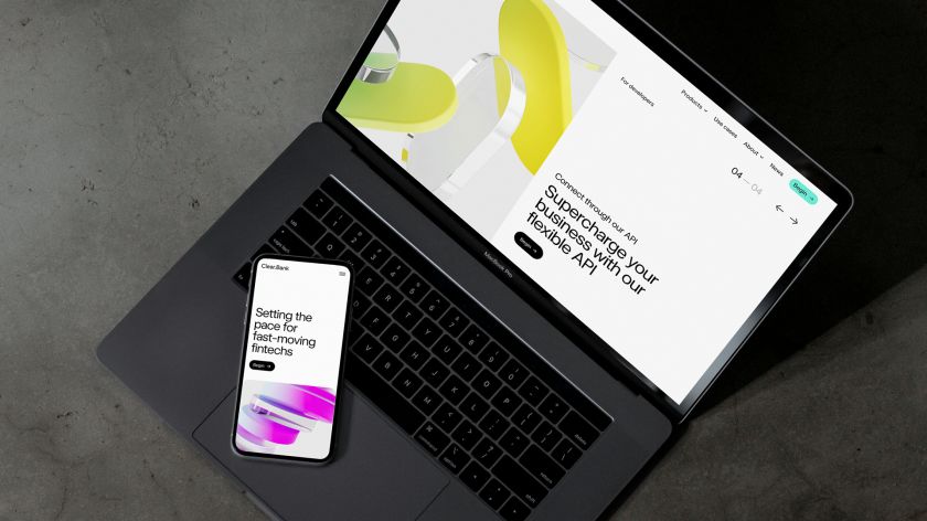
“We worked with the team to articulate what they do, which came together as four products outlining the offering and seven use cases to show how that impacts different sectors and contexts. These are supported visually with ClearBank’s 3D renders and photography that captures the people behind the service.”
To help reposition ClearBank as a market leader, the company’s website was given an overhaul on par with its graphics. Working closely with the Output team, they outlined a tailor-made information architecture, defined their services, and showcased the credibility they have built up over the last five years with use cases.
Appearing across all of ClearBank’s digital platforms and physical marketing materials, the crisp, clear, and mathematically-perfect rebrand not only helps to onboard new clients but also amplifies lead generation.
“We’re a group of ambitious and spirited people who are changing the very fabric of banking – and we’re moving quickly,” says Charles McManus, ClearBank CEO.
“Output worked with us to take our brand to the next level while showcasing our innovative technology and bringing out the essence of our people. They challenged our thinking and delivered a bold new brand ready to take into new markets and a direction that will serve ClearBank well into the future.”
Related Posts