Credit: Pentagram
Design legend Paula Scher explains how brought , a 100-year-old German wine brand into the modern era through an infusion of personality and Art Deco style.
Blue Nun first launched in 1923, with a 1921 vintage. Its original packaging was groundbreaking at the time. Its more direct, consumer-facing design stood in direct contrast to the longstanding decadent, Gothic-scripted cues of most German wines, whose comms hinted at history but made no effort to connect with the present.
Thanks to this revolution in branding, Blue Nun became an international favourite: a friendly, affordable wine with mass appeal.
To celebrate the brand’s 100th birthday, Pentagram has reimagined the wine’s famous approachability and playfulness for a new generation. According to Paula Scher, who led creative on the project, the design is: “saucy, beautiful, and funny all at once”.
Credit: Pentagram
Credit: Pentagram
Blue Nun’s original label image depicted 18th-century nuns picking grapes in a vineyard. But for the anniversary, the Pentagram wanted to capture the lively, indulgent spirit of the Roaring Twenties decade that birthed the brand.
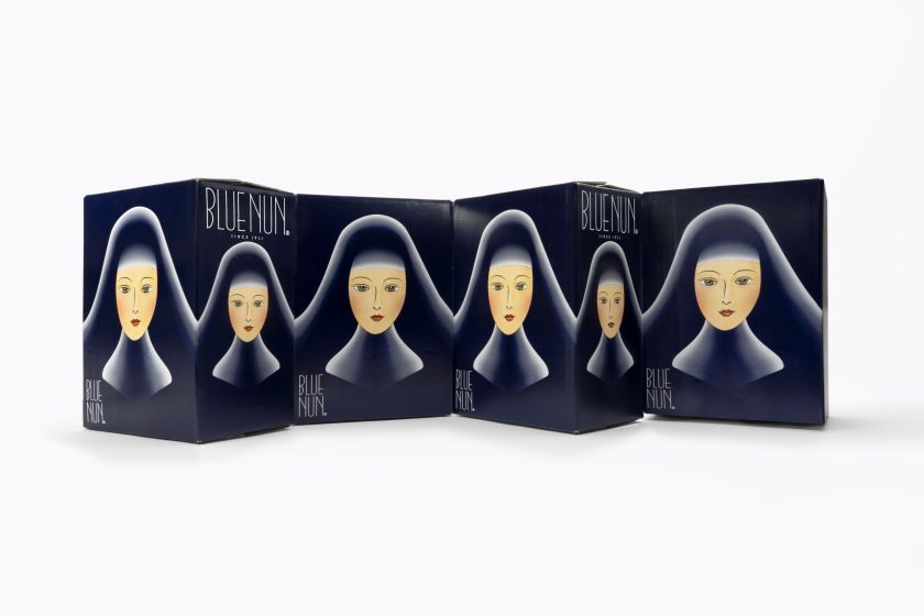
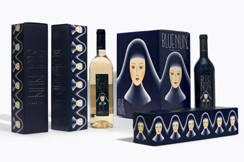
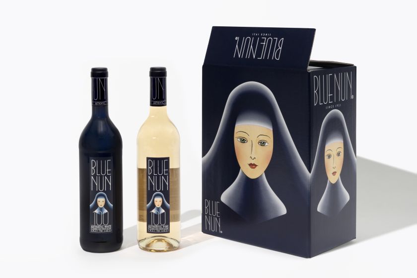
The result is a stunning and effective full makeover for Blue Nun’s iconic nun.
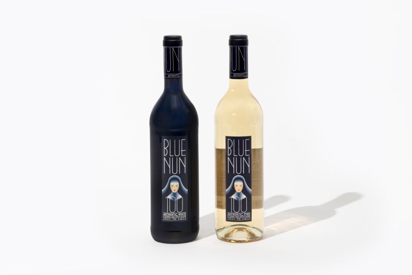
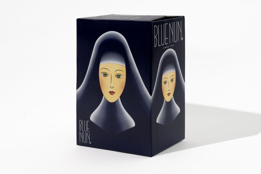
The new label features a saucy, glamorous portrait of a blushing nun inspired by the French 20th-century designer and Art Deco artist Erté, who often celebrated the beautiful, bold women of the 1920s in his art.
Scher explained that she and her team were deeply invested in connecting the new Blue Nun look back to the 1920s, so there was a lot of research into graphics and illustrations at the time, and Erté’s work stood out above the rest. Scher told Creative Boom: “Erté was a natural choice. He drew beautiful and elegant idolized women, and we wanted a beautiful nun.”
Erté’s influence on the new Blue Nun mascot is clear, but Scher also brought her own sensibility to the design. Motion offers a fresh new layer that brings the 1920s inspiration straight into the 21st century. In fact, it looks like Scher and her team’s design intuited the recent “doe eyes vs siren eyes” .
When the nun makes flirty eye contact with viewers of the brand’s web and social platforms, the full cheekiness of Pentagram’s vision for the brand comes to light.
Credit: Pentagram
Credit: Pentagram
Credit: Pentagram
Credit: Pentagram
For a more refined look, Scher and her team opted to ditch Blue Nun’s dated chunky type for a thin, hand-drawn font. Scher told Creative Boom: “We drew the font, but it was styled in a manner derived from ’20s typography, though thinner than the fonts of the time. The design of the imagery and typography was really contemporary but with a nod to the ’20s.”
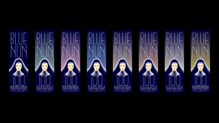
An elevated colour palette and set of gradients bring the whole thing together. Scher and team complemented Blue Nun’s historical pale blue with a richer, more sophisticated tone that borders on indigo. Then, a range of background gradient hues was created to bring points of difference to each of Blue Nun’s distinct wines.
The new Blue Nun identity and packaging are everything wine drinkers want: Saucy yet sophisticated, rich but accessible, and stylish without being stuffy. But Scher summed its appeal up best: “It’s good time wine!”

Credit: Pentagram
Related Posts