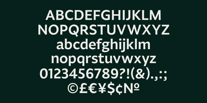
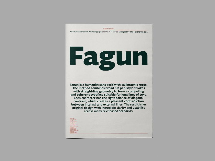
Independent type foundry has released Fagun – a highly readable, humanist sans-serif typeface with calligraphic roots designed to make reading long lines of text easier.
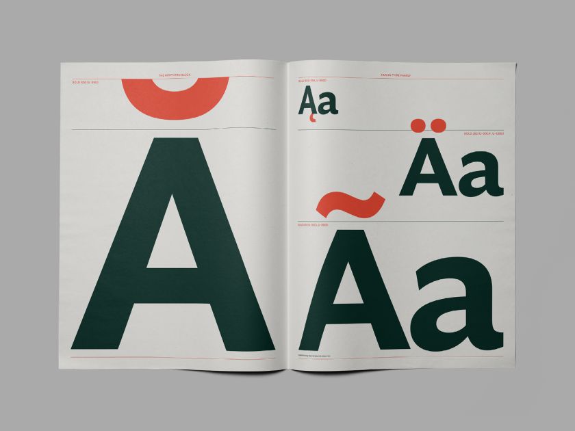
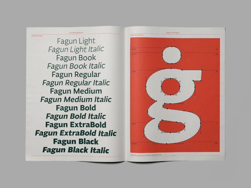
The complete family of 14 fonts takes significant inspiration from 19th-century type styles by including small caps and alternate lowercase, a type trend commonly seen in the Victorian era.
The font itself was influenced by several typefaces, making its group tough to define, but it has a distinct calligraphic style to create a robust hand-drawn feel. The method combines broad nib pen-style strokes with straight-line geometry to form a compelling and coherent typeface suitable for long lines of text. Each character has the right balance of diagonal contrast, which creates a pleasant contradiction between internal and external lines.
These elements, combined with the fact that Fagun is designed to be read at any size, make the font both visually appealing and clear to read – something that was important to the Northern Block team, which had accessibility and inclusivity top of mind when designing .
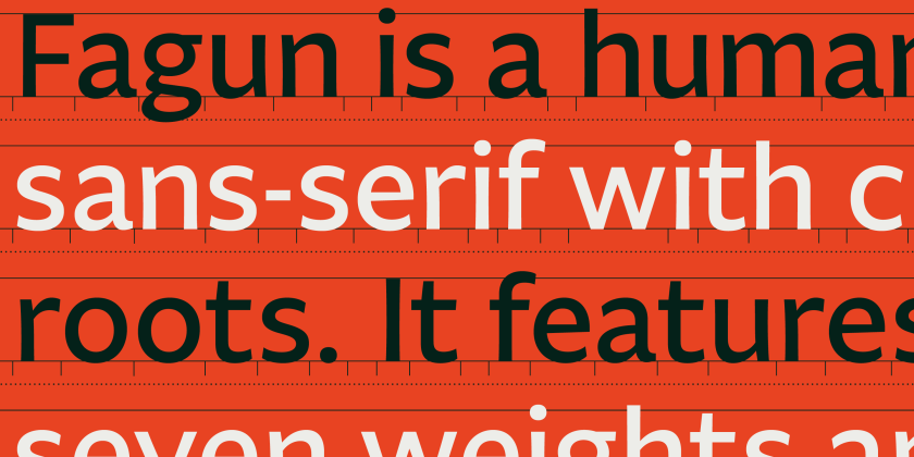
“Fagun embraces the all-important dimension of inclusivity and contemporaneity, which innovation always demands,” Jonathan Hill, founder of The Northern Block, told Creative Boom. “From my perspective, Fagun differs [from similar typefaces] in that it does not commit 100% to true calligraphic principles.” Hill and his team wanted to ensure the typeface had a proficient level of modernity, so Fagun combines both hand-drawn lines with pure straight mathematical lines.
Hill added: “Alternative characters are not offered by similar typefaces, so with Fagun, I wanted to create some alternatives that would give the design a different flavour and reinforce the functionality in readable text.”
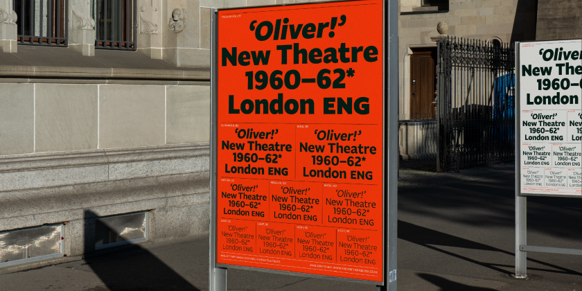
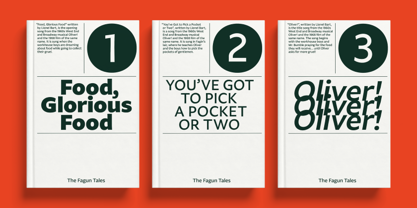
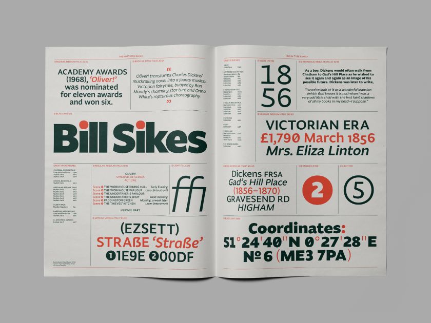
The 19th century looms large over Fagun. Alongside sparking inspiration for those alternative cases, popular Victorian art also inspired another key element of the typeface: Fagun is an intentional misspelling of Fagin, the infamous leader of a ragtag band of pickpockets who take in the titular orphan of Charles Dickens’ 19th-century novel, Oliver Twist.
Dickens’ novel, and the 1968 musical version, also inspired The Northern Block’s clever promotional imagery for Fagun. The team put the type into action by creating sample assets featuring lyrics from the musical and even mocked up a performance poster for Oliver Twist. The flexibility and function of the font are fully explored in a 44-page print specimen, in which The Northern Block also infused with Dickensian references.
Hill and his team have successfully created a highly versatile font that’s as functional to use as it is lovely to look at.
The assets, including the print specimen, lean into Fagun’s editorial function – and it’s easy to imagine the typeface becoming a house font for magazines and papers. But there’s also plenty of potential for broader design use. Its unique but legible style also makes Fagun a prime contender for word marks, and its editorial perks could easily translate into OOH advertising possibilities.
Flexible, unique, and functional as it is, Fagun is most definitely a font to watch out for in 2023. Discover more or purchase the complete family of 14 fonts at .
Related Posts