It can’t be easy rebranding a cultural icon with a history stretching back nearly 50 years, but that was exactly what Amsterdam-based studio faced when tasked with creating a new identity for Belgium’s biggest music festival, Rock Werchter.
The first ever Rock Werchter took place in 1975, with about 1,000 music lovers in attendance, and now, the event attracts 90,000 visitors for each day of its four-day run.
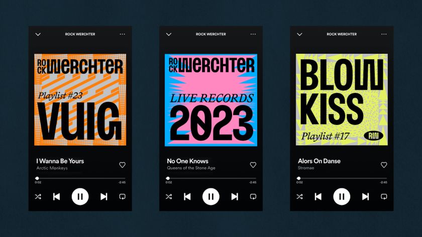
Tin created a new logo, custom condensed typeface, and a collection of patterns to use in various colour combinations across the identity. “An essential part of the rebranding was creating a new brand identity that is as familiar for the loyal returning visitors as exciting for the newcomers,” says Tin.
The studio continues, “Back in the 70s, Rock Werchter and many other rock festivals and concerts were often introduced in the same characteristic way – stacking all info with an all-caps condensed typeface close together, and using all space on the canvas to share as much information as possible.”
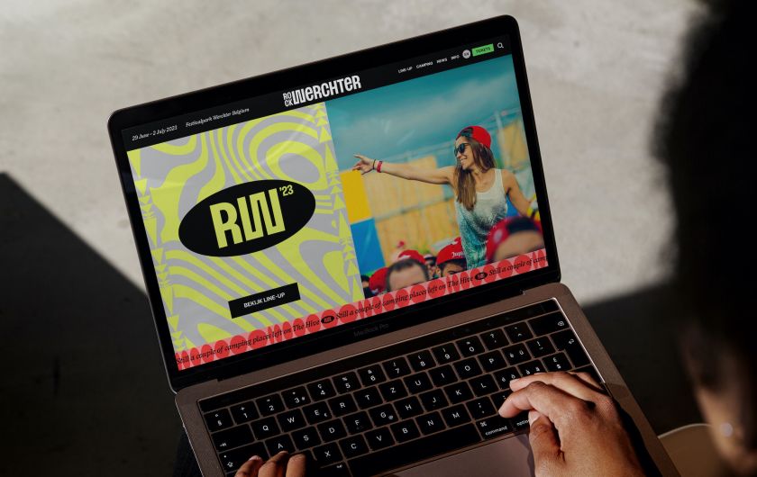
As a nod to the festival’s visual history and storied heritage, the new identity nods towards that ‘stacked’ layout, while the logo deliberately highlights the ‘Werchter’ over the ‘Rock’ to reference the fact that today, the event showcases numerous different genres.
One of the main aims of the new identity was to appeal to both the loyal fans who’ve been coming to the festival for decades while addressing the fact that “the younger target group may not always feel represented enough,” as Tin puts it. “The challenge for us was to create a dynamic brand that feels familiar to returning visitors and simultaneously challenges a new generation of music lovers.”
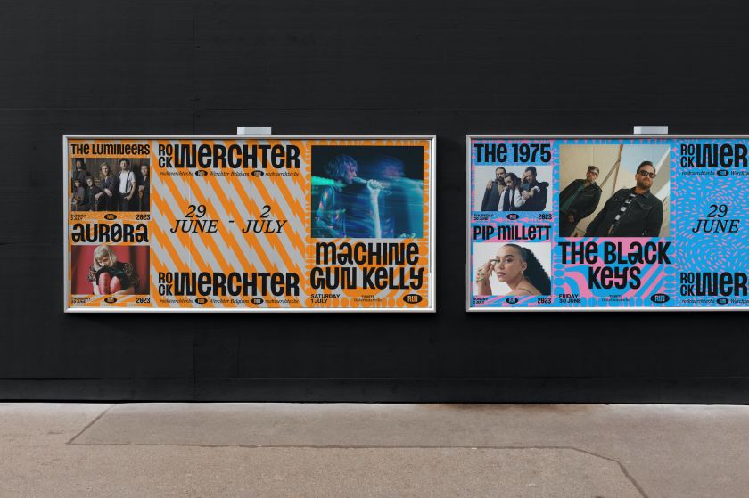
As well as being more inclusive, the new visual identity needed to flex across an extensive array of applications with wildly different dimensions. “The scale [of the festival] is gigantic at all levels,” says Tin. “The patterns, in combination with the various colour pairs, represent the fantastic variety of all the different music genres and moods – from incredible headliners to punk, pop, singer-songwriters, electronic music and everything in between. Together it creates an eclectic and festive visual language that’ll evolve and expand over the years.”
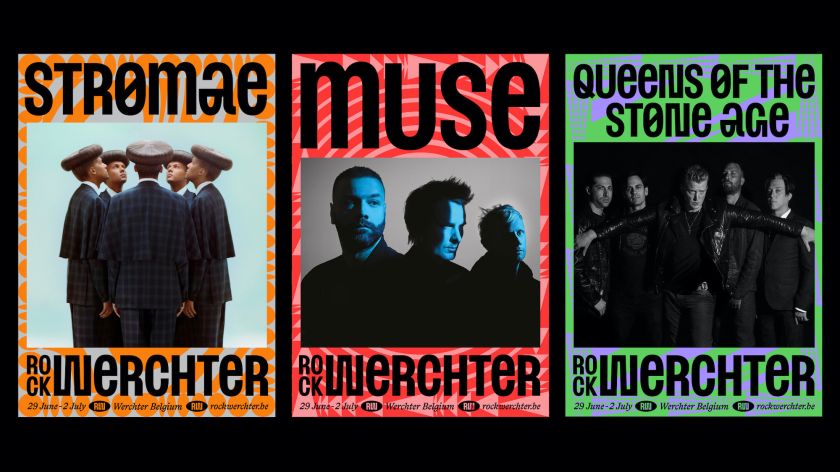
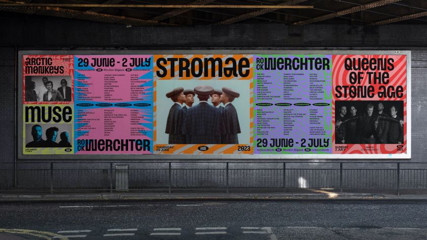
One of the most striking aspects of the new identity is the lettering. Tin worked with type designer Edgar Walthert to create a bespoke, “quirky” condensed Rock Werchter typeface dubbed RW Werchter that references the festival’s history and graphic heritage through its use of all-caps lettering that usually appears with words stacked on top of one another. Walthert largely worked on the numerals and optimising the alphabet created by Tin.
The brand font is used alongside by Swiss type foundry Lineto. This was chosen as a complement to the bold, bombastic forms of RW Werchter for graphics where things needed a little paring back or where the designers felt that an additional font was required “to make the overall appearance a bit more friendly and balanced – to be able to turn the volume down a bit,” says Tin.
The new Rock Werchter identity will be revealed in full in early July at the festival, but can already be seen across its and elsewhere.
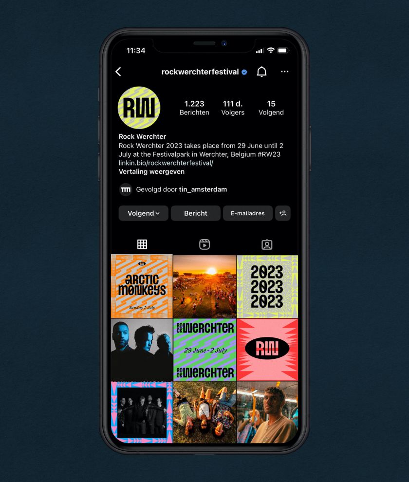
Tin was founded in early 2020 – just before the outbreak of the Covid pandemic – by three designers who’d known each other for ten years before setting up shop together. The studio name refers to that history since tin traditionally marks ten-year anniversaries. Tin prides itself on its international outlook: its team comprises people from Italy, France and The Netherlands, and its projects span China, the US, Germany and Belgium.
Related Posts