A lot of investment “analysis” is simply finding a reasonable and convincing way to explain present market prices. Whatever the price is, you can find a story to match. Working backwards like that means there usually isn’t much useful nor actionable information. I say this before I link to the recent Vanguard article , mainly for this chart of what they see as a “fair value” for CAPE (cyclically-adjusted PE) or PE10 (price/average earnings over last 10 years):
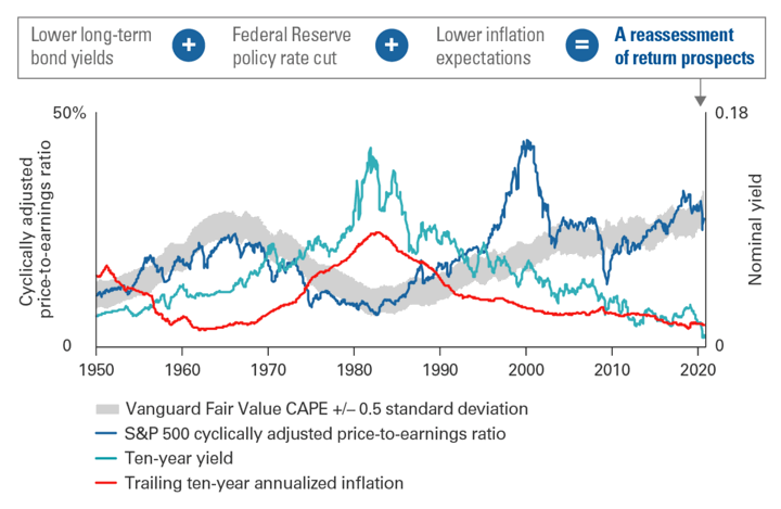
Vanguard’s U.S. fair value CAPE framework is based on a statistical model that corrects measures of cyclically adjusted price-to-earnings ratios for the level of inflation expectations and for interest rates. The statistical model specification is a three-variable vector error correction including equity-earnings yields, ten-year trailing inflation, and ten-year U.S. Treasury yields.
Basically, low interest rates (with low inflation) mean that stock earnings are more attractive and thus result in higher price/earnings (PE) ratios. The rest is the usual hedging and disclaimers. “The market could go up or down from here.”
Rates are not just “low”, they are the lowest in history. The real yield on 30-year TIPS (inflation-linked Treasury bonds) are negative for the first time in history – so low that people are willing to hand over $116 today in order to get only $100 back (adjusted for inflation) after 30 years! If bonds are the most expensive in history, does that mean the stock market should be the most expensive in history? The S&P 500 did just hit an all-time high amidst enormous economic suffering for much of the working population. This chart tries to make sense of things, but still I don’t like the idea of calling the current state of things “rational”.
“The editorial content here is not provided by any of the companies mentioned, and has not been reviewed, approved or otherwise endorsed by any of these entities. Opinions expressed here are the author’s alone. This email may contain links through which we are compensated when you click on or are approved for offers.”
from .
Copyright © 2019 MyMoneyBlog.com. All Rights Reserved. Do not re-syndicate without permission.
Related Posts