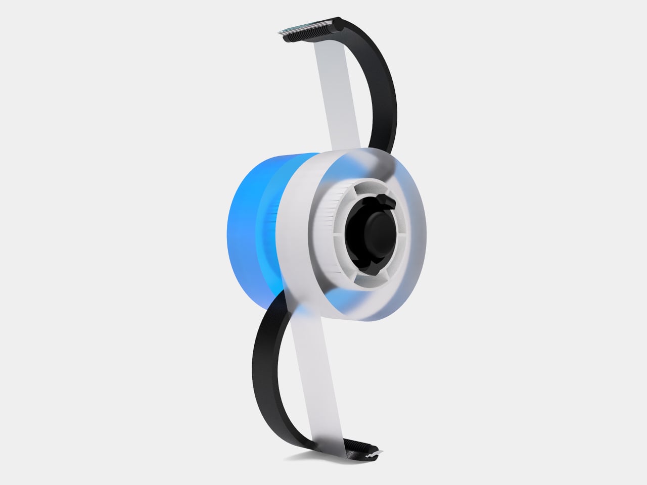
The standard tape dispenser holds one roll, cuts tape, and sits on a desk. It hasn’t changed much in decades, and it doesn’t need to because it does its job reliably. The problem is that it looks exactly as utilitarian as it sounds, and the design conversation around it has mostly been limited to making that single-function object look slightly more attractive without actually adding anything.
This concept takes a different approach. Instead of polishing the existing formula, the Dual Tape Dispenser starts from the premise that holding two rolls is more useful than holding one, and that a more sculptural form can make the whole interaction better. The result is an object built from flowing arches that feels different to use and looks different sitting on your desk when you’re not using it at all.
Designer:
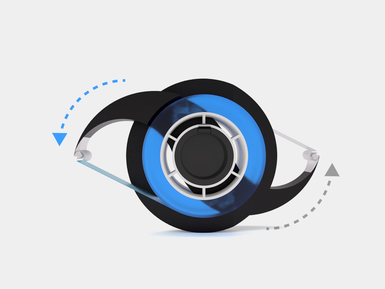
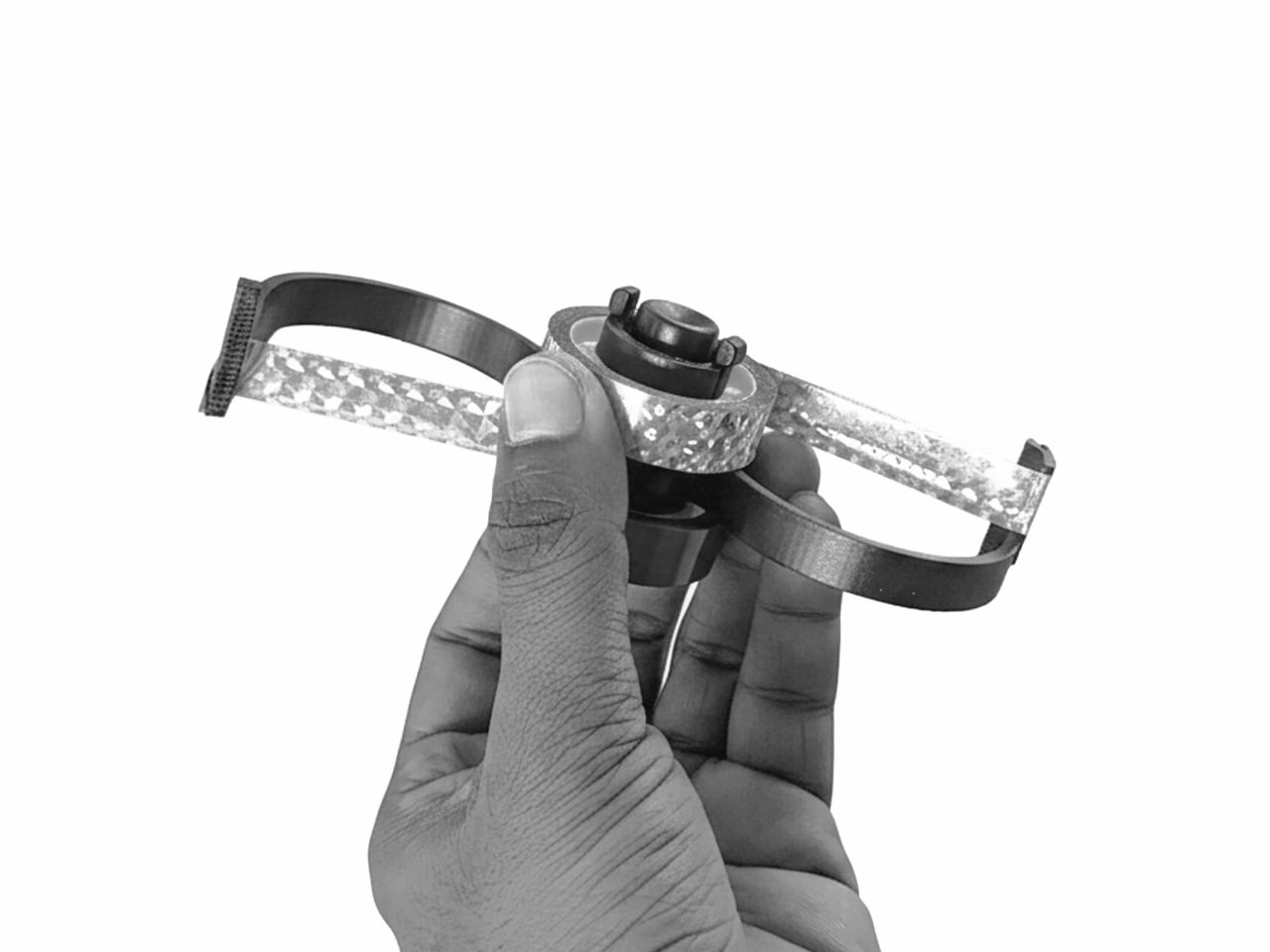
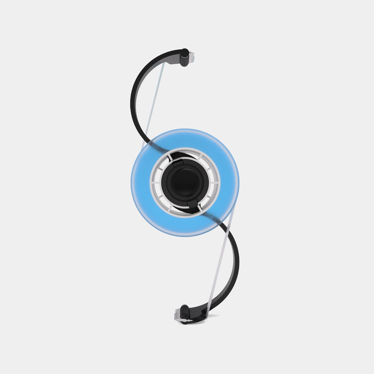
The design rests on its own curves, so it can sit in different orientations depending on what’s most convenient. Two circular tape housings connect through flowing arches that also serve as natural hand guides, directing the grip toward the tape without any conscious adjustment. The whole motion feels more intuitive than reaching over a rigid, weighted box, which is how most interactions with a standard dispenser tend to go.
The dual-roll format addresses something familiar in most working studios and offices. Having two different tapes in one object, whether clear and masking or two different widths, means one less thing to hunt for mid-task. It’s a modest improvement in isolation, but the kind of friction it removes adds up across a busy day, and a single compact form keeps the desk considerably tidier overall.
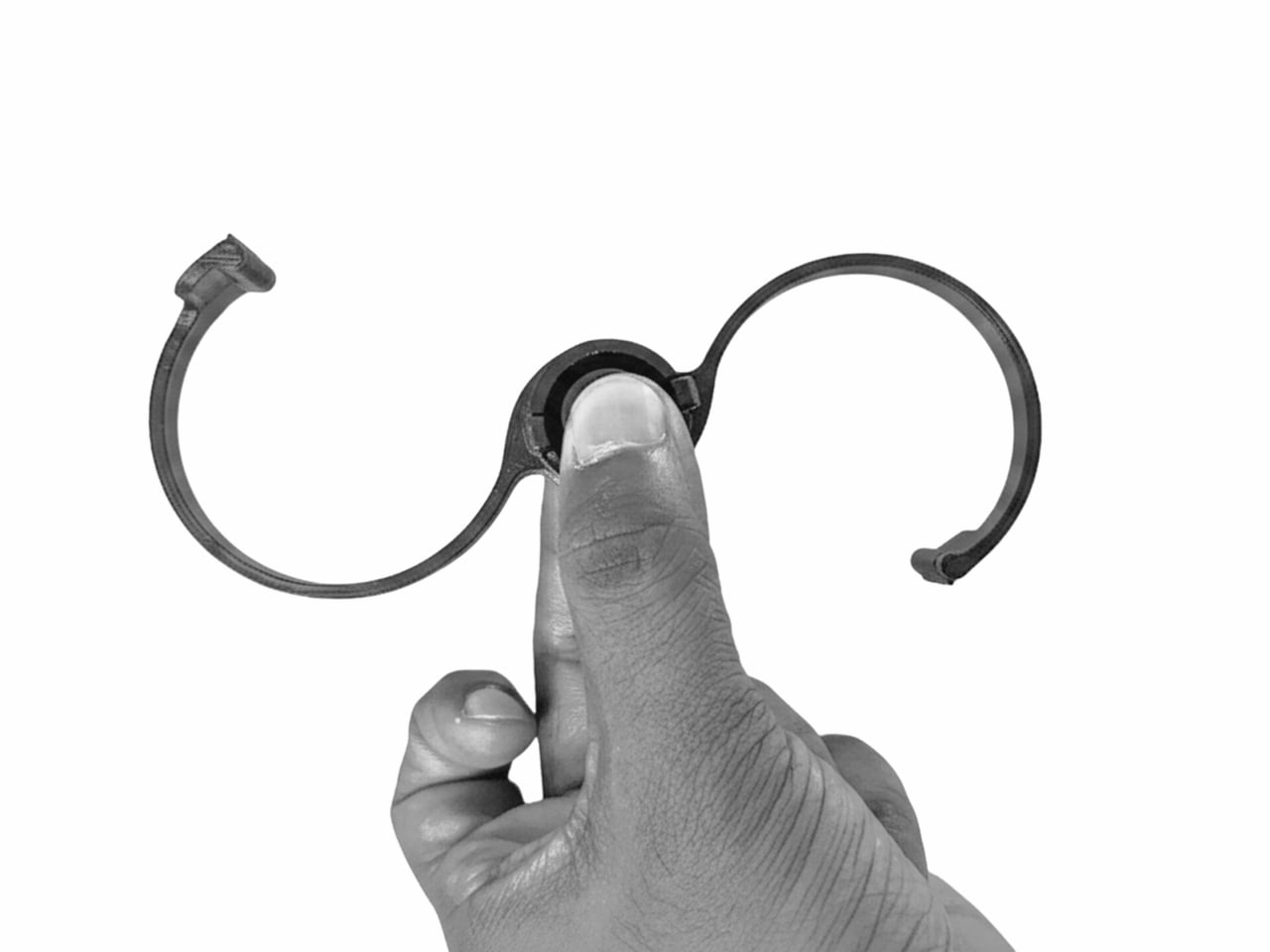
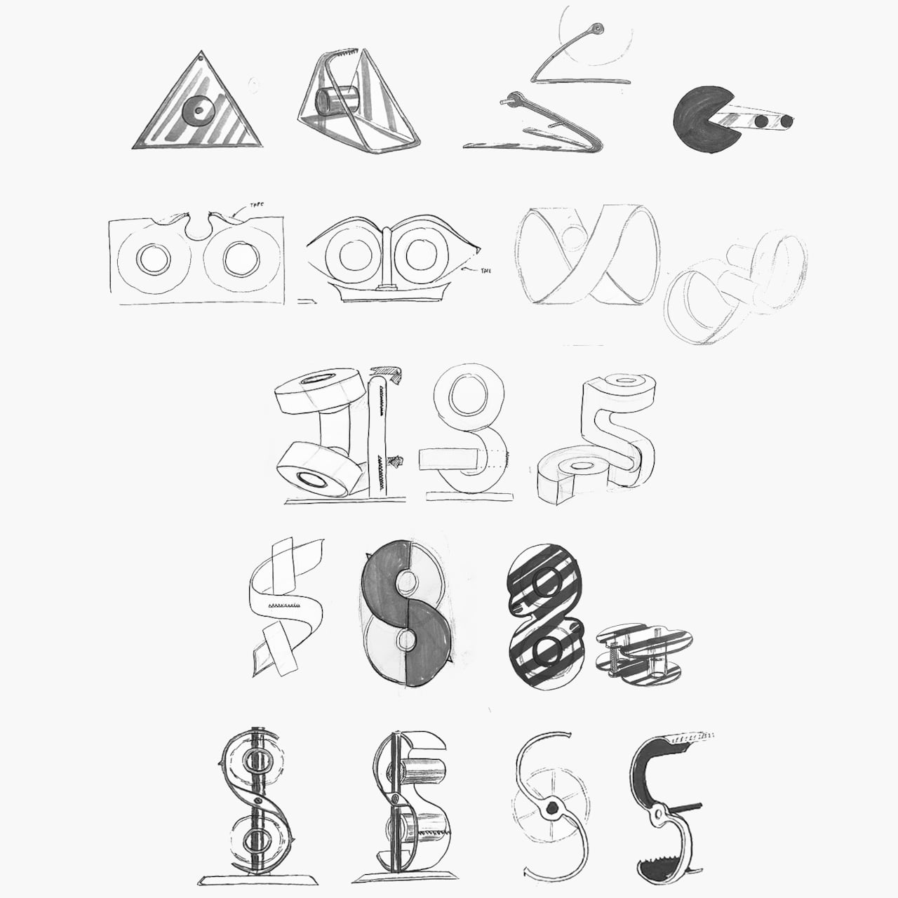
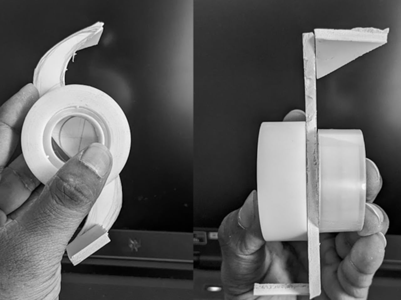
Getting to that form wasn’t straightforward. Early explorations of the concept were bulkier and more complex, with feedback pushing the design toward something stronger, less cumbersome, and more restrained. The final form emerges from that iterative process, minimal in part count and clean in its assembly logic, which also points toward something that could be manufactured without excessive complexity if the concept moved into production.
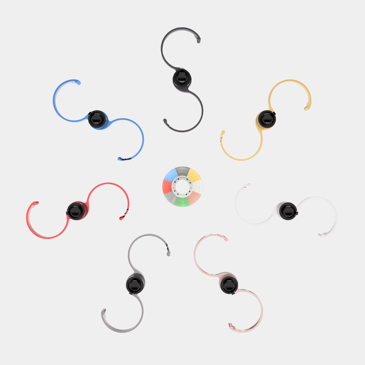
The dispenser can be made available in multiple colors, giving it a range that spans from understated neutrals to more vivid options, depending on how much you want it to stand out on a desk. The soft circular geometry and balanced proportions keep it from feeling imposing, which is a real consideration for something that might end up between a monitor and a coffee mug. It’s visible without being demanding.
That quality is something the design leans into deliberately. The brief treats the dispenser as an object that could be a conversation starter as much as a practical tool, and the sculptural arch form supports that without overclaiming. A tape dispenser doesn’t need to draw attention to itself, but there’s no rule saying it can’t, and this one makes a reasonable case that it could do both at once.
The post first appeared on .
Related Posts