Belfast design studio Angel & Anchor was tasked with creating a visual identity for the new city nightspot Southside Social. From the colour palette to typography, here’s how they went about it.
It’s often difficult to define what makes a specific bar a hit. In the case of in Belfast, which opened in November 2022, it probably has a lot to do with the carefully crafted visual identity created by the local design studio .
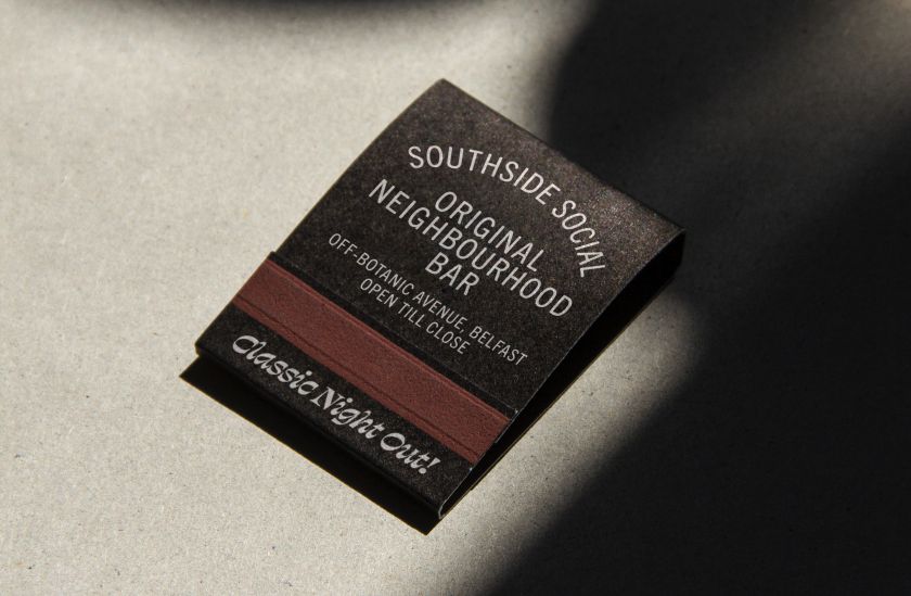
Southside Social is located just off Botanic Avenue, one of the city’s busiest streets: a place packed with options for eating and drinking and popular with young people and students. With love for atmospheric, timeless interiors and brand stories, the owners approached Angel & Anchor – which describes itself as a “ballsy branding studio” specialising in strategic identity systems – to create a full identity that would match their vision.
We’re big fans of Angel & Anchor, having previously reported on projects such as their . So we were excited to see what they’d come up with here, and they didn’t let us down.
The concept
The team’s discussions began with the owner’s admiration for classic cocktails and late-night catch-ups. A narrative expressing the bar’s charming, confident and easygoing personality was developed, inspired by Mad Men and 80s social clubs, and this informed both the fit-out and visual identity.
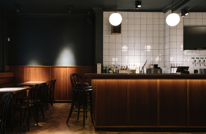
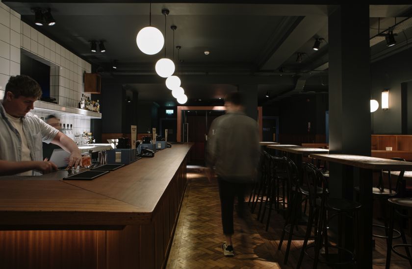
Art direction and interior design worked together to bring a combination of nostalgia and comfort to the space. Wooden panelling, green leather booths, a New York-style cocktail bar and an in-house Chinese takeaway were created in partnership with interior design and architecture studio and joinery specialists at .
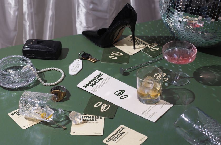
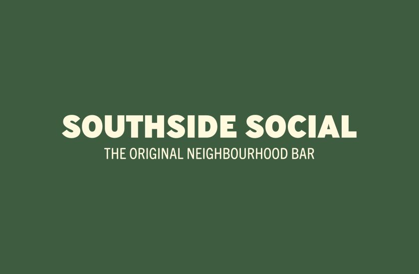
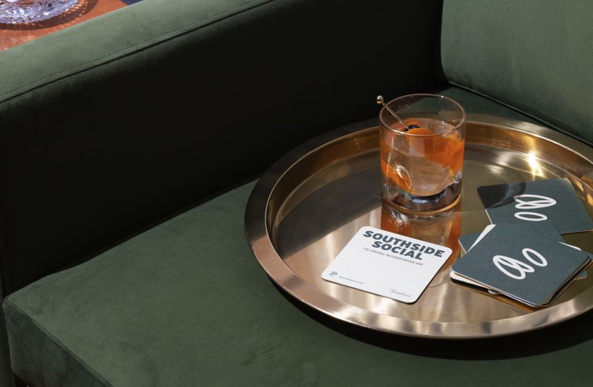
The Southside symbol logo, meanwhile, pays tribute to multiple markers of a good night out, including the tipping of cups to cheers, speech bubbles of a bustling bar, and ’rounds’ among friends. Inspired by old sports clubs and retro lounge coasters, this simple yet dynamic logo gives the bar a sense of timeless personality.
Colours and typography
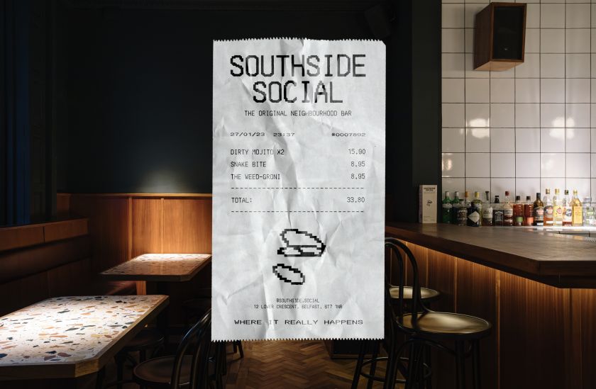
Along similar lines, the Southside Social’s colour palette was informed by the spirit of 80s bars and smokey social clubs, with hues such as Beer Foam White and Gulf Blue. Uniting the physical space and the visual identity, these colours infuse each cocktail menu, social post, billboard and bathroom sign, adding a burst of personality to each.
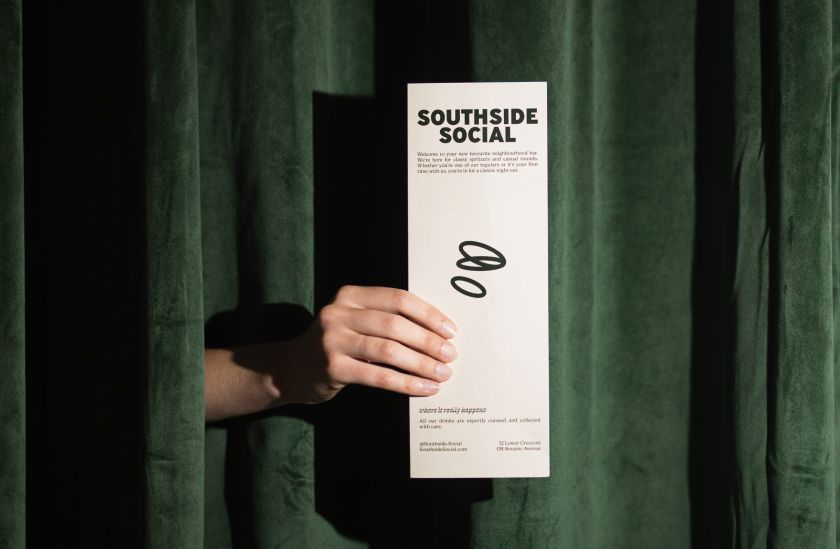
Brand language formed another critical component of Angel & Anchor’s work. The ethos of the language focuses on the community-centred nature of the bar with phrases like “the original neighbourhood bar” and “where it really happens”. A set of key and secondary phrases bring the bar’s character to the forefront of its interactions with the public and express its brand personality through written form.
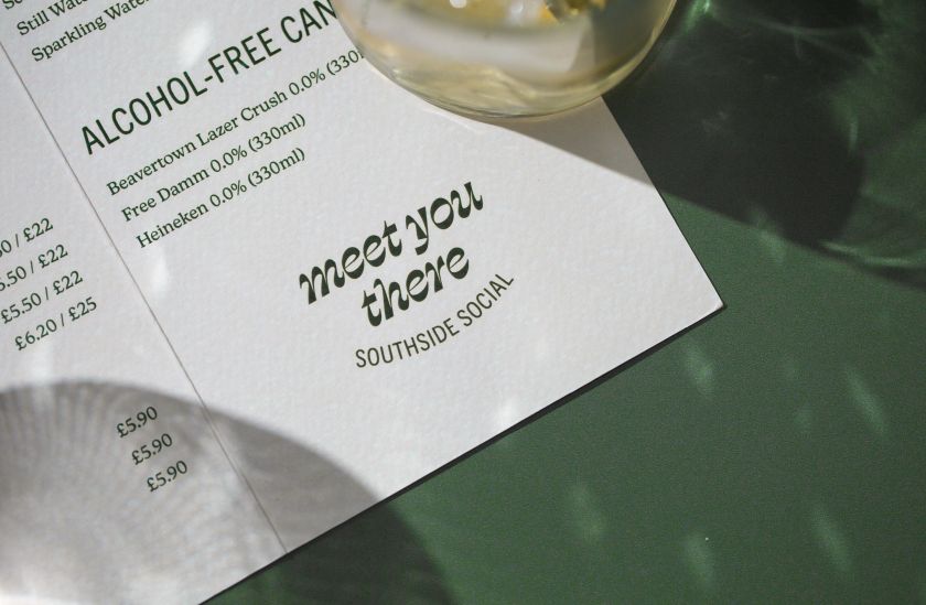
As for typography, the rounded serif typeface is used for body copy, providing a sense of mid-century character and personality, at the same time as offering clarity and legibility. Elsewhere, highlights key phrases from the brand language and pushes the bar’s more modern and “place-to-be” tone. This transitional typeface with high contrast and sloping letters brings messaging phrases like “Cheers to that” and “Meet you there” to life with a laid-back classy attitude.
Taken together, these typefaces, brand language, logo mark and logotype create a look for the bar and its brain assets that manage to be energetic yet laid back at the same time and communicate a well-defined personality and a clear point of view.
Related Posts