In the realm of automotive industry transformation, Carvertical emerges as a true pioneer, reshaping the landscape of car data dealerships. The company’s rebranding journey, meticulously crafted by , stands as a testament to its commitment to democratizing expert knowledge in a field traditionally dominated by a one-dimensional masculine perception.
Carvertical’s profound understanding of its diverse audience, highlighted through comprehensive research and surveys, revealed a multifaceted demographic. This revelation marked a pivotal moment, signaling the need for a brand identity that resonated with both men and women, experts, and novices alike.
And so, the rebranding initiative embarked upon a mission to redefine Carvertical’s image, moving away from the digital color extravagance embraced by competitors. Instead, they sought to embody a genuinely inclusive and welcoming approach to automobiles. The inspiration drawn from the essence of their service and reflected in the revamped logo’s graphic perspective was a pivotal starting point.
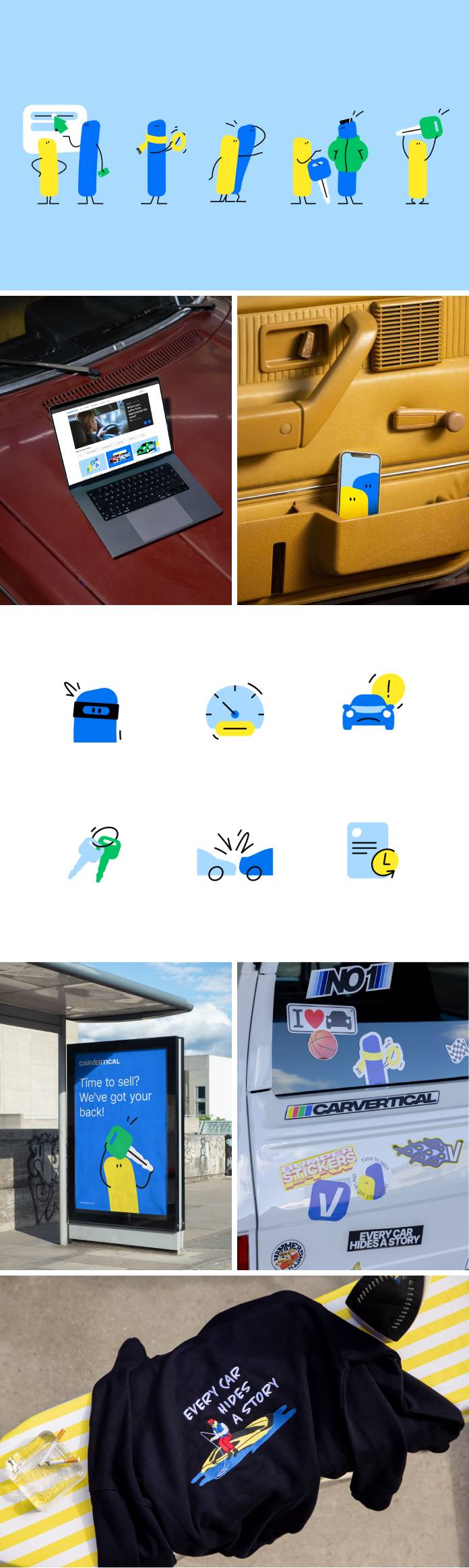
Central to this new visual identity was the emblematic “V” in the logotype, serving as a symbolic checkmark and laying the foundation for the creation of Carvertical’s endearing mascots, Vertical & Vertical. The duo’s minimalist design, characterized by rounded contours and simple black-line limbs, perfectly encapsulated the brand’s ethos of simplicity and adaptability.
Throughout the branding narrative, Vertical & Vertical emerged as guiding companions for customers navigating their car journeys. Their presence ensured a sense of empathy, understanding, and a welcoming atmosphere, crucial elements in a landscape often perceived as intimidating.
The visual language adopted by Carvertical seamlessly blended warm-toned, natural photography with simplified infographics and clear sans-serif typography. This deliberate choice fostered a feeling of familiarity and user-friendliness, ensuring that customers felt at ease throughout their interactions with the brand.
With this transformative rebrand, Carvertical now stands prominently, bolstered by a cohesive and flexible identity that sets it apart in the market. The playful and inviting persona adopted by the brand, complemented by the endearing mascots, beckons both seasoned enthusiasts and novice buyers, ushering in a new era of accessibility and inclusivity within the automotive industry.
All images © by Andstudio. Don’t hesitate to visit Anstudio’s and page. Feel free to find more inspiring projects from all over the world in the Graphic Design and Branding sections on WE AND THE COLOR.
Subscribe to our newsletter!
The post appeared first on .
Related Posts