The renowned Scottish artist has explored the boundaries of his iconic Acrylic Fusion technique in his new identity for coffee tech startup , created in collaboration with .
No industry stands still, not even something as timeless as coffee. A cafetiere or a spoonful of granules won’t cut it in the modern age, not when there are tech startups like BrewBird making inroads into the coffee industry.
Promising to deliver “coffee that sings”, BrewBird describes itself as the most technologically advanced drip coffee brewing platform around. At the push of a button, users of BrewBird devices can start pouring themselves freshly roasted beans tailored towards their precise specifications. All they’ve got to do then is decide whether to add milk or sugar.
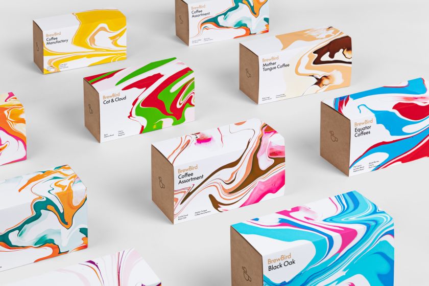
A new approach to coffee demands a new approach to branding, though. Images of coffee beans spilling out of hessian sacks would look at odds with BrewBird’s technical wizardry, after all. To help bring together the startup’s unique blend of artisanal coffee and technology, BrewBird turned to design studio Mucho and to create a suitable brand and packaging system.
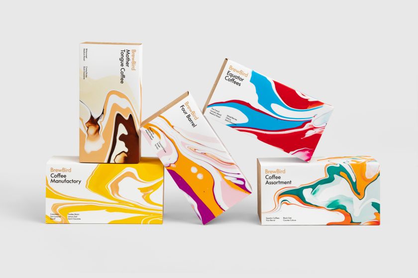
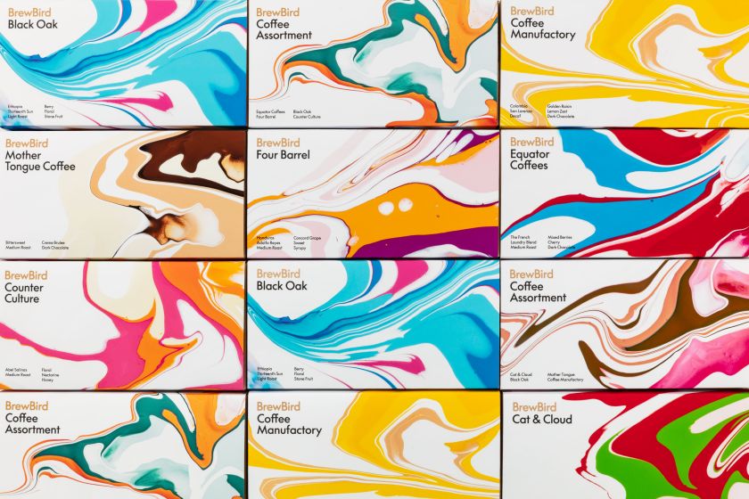
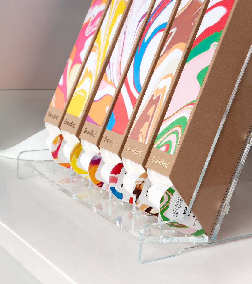
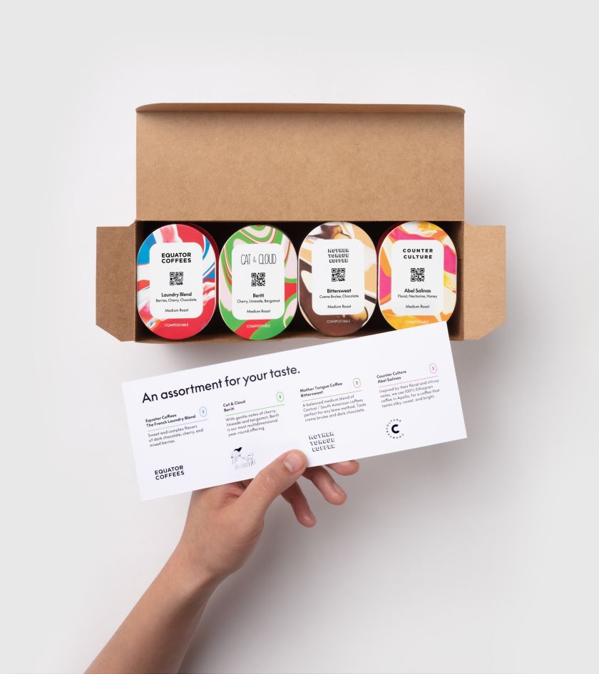
The result is unlike any other coffee brand on the shelves. BrewBird’s products are now decked out in packages covered in spilling, oozing colours that push Craig’s signature Acrylic Fusion technique to the limits and reflect the very nature of its coffee as it steadily drips from a roaster into a cup.
Mucho Creative Director Rob Duncan explains the thought process that went into this revolutionary rebrand: “The coffee industry is already saturated with some really great brand identities and experiences. We wanted to create something truly unique and memorable for BrewBird.”
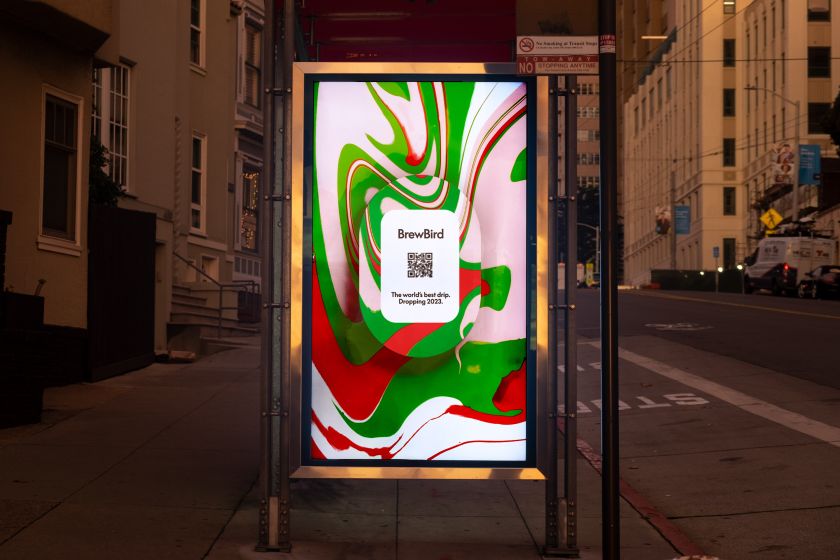
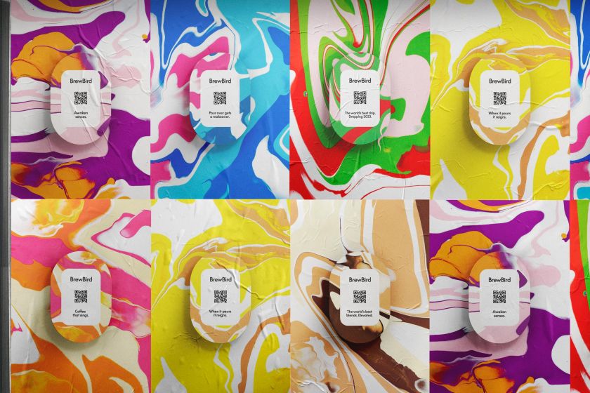
He adds: “What better than using a pour-over paint technique for the latest development in pour-over coffee? Potential customers are attracted to the packaging when they see it at BrewBird pop-up locations. They expect it to be some sort of art installation and are surprised to find it’s actually packaging for coffee.”
To get the perfect pour-over paint look, Mucho flew Craig to their San Francisco studio to create a one-of-a-kind series of paintings. These pieces reflected the flavour profiles of BrewBird’s coffee in their colour scheme, resulting in swirls of green, purple and red that create a “lively, joyful, and extremely memorable experience, unique to the coffee industry space.”
The artist adds: “It was absolutely brilliant collaborating with Mucho and BrewBird on this project. I loved the challenge of experimenting with different Acrylic Fusion colour palettes to capture the flavours and aromas of the BrewBird coffee bean – pushing the boundaries of what Acrylic Fusion is capable of.”
Accompanying these swirls of colours is a new BrewBird logo that cleverly turns the brand name into an Easter-Egg-packed icon. The two letter ‘B’s become both a bird and a coffee cup depending on how you look at them, yet the deceptively simple design doesn’t threaten to overshadow Craig’s paint patterns.
Alongside this, the identity uses LL Supreme by Lineto due to its understated and sophisticated aesthetic. Paired with a complementary palette of primarily black, white and bronze, BrewBird is equipped to be the coffee brand with the freshest drip in town, both in terms of look and taste.
Related Posts