When arts centre Tacoma Arts Live moved to a new area, a brand refresh and new wayfinding were urgently needed. Design studio ThoughtMatter explains how it went about it.
Wayfinding is one of the most challenging tasks in graphic design. You want it to be on-brand, attractive and fun, but it must also be functional. When people are in a hurry, they’re in no mood to appreciate your clever typography if they can’t quickly find out where to go.
Here’s a great example from brand design studio , who were tasked with creating new branding and wayfinding for their longtime client Tacoma Arts Live – one of Washington state’s largest performing arts centres.
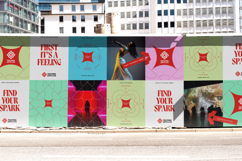
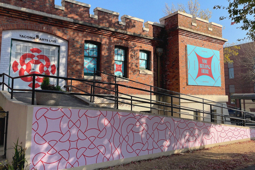
Forced to move to a new neighbourhood, Tacoma Arts Live’s wayfinding, signage, and posters became crucial. Such massive change made a case for urgent reintroduction to its community. The goals were to refresh the brand and communication frameworks with updated designs and wayfinding approaches that would challenge audiences to engage with the arts organisation.

“Tacoma Arts Live was amid some of the largest changes and opportunities in its history, particularly the change to embrace its new home at the Tacoma Armory,” says ThoughMatter’s strategy director, Phillip Lauria. “The organisation’s focus had to change, but there was also a huge opportunity to reintroduce Tacoma Arts Live in a bold way – ingratiating themselves within a new neighbourhood.”
ThoughtMatter, which is known for its work with cultural institutions like Yerba Buena Center for the Arts, NYC’s Greene Space and The Rubin Museum of Art, developed a strategy based on the organisation’s ability to look inward and reignite what made people fall in love with the arts in the first place.
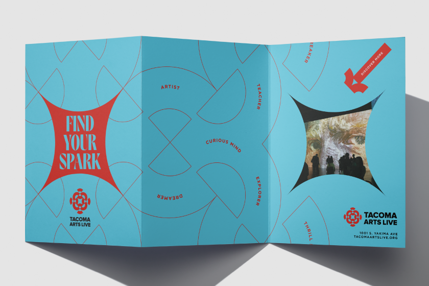
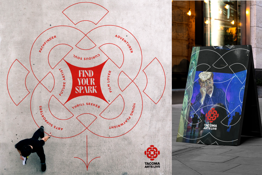
Eventually, they decided on the idea of a ‘spark’ as a visual and thematic way to use elements of the existing brand mark but rooted in the organisation’s four decades of history.
“Once we landed on the positioning of ‘Inciting the Spark Within’, recognising the graphic spark at the heart of the current brand mark, it felt like a huge moment of realisation,” explains ThoughMatter creative director Ben Greengrass. “Using that spark symbol as the catalyst and focal point of the system, we created a more expressive campaign.”
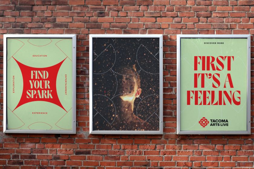
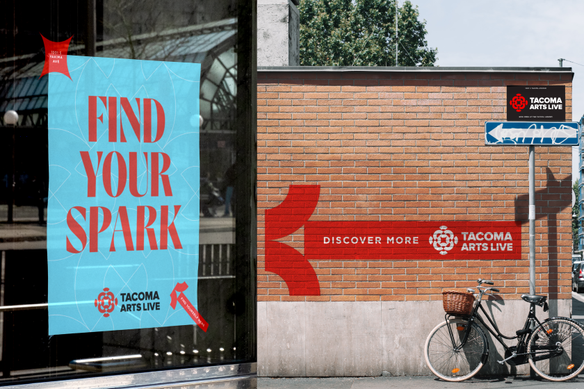
The ThoughtMater team utilised the existing brand red in new ways, pairing it with a complementary but energising colour palette, a new typeface that visually echoed the brandmark, a brand pattern, and a more progressive messaging framework.
For wayfinding purposes, ThoughtMatter designed a set of arrows built from Tacoma Arts Live’s own deconstructed brandmark, physically directing the community to the Tacoma Armory, a building few in the community even knew was an arts venue.
Using the spark as an effervescent visual representation of a powerful energy source that fuels creativity and potential, Tacoma Arts Live’s design system gives the organisation tremendous flexibility. Ben believes this will be key in allowing the organisation to adapt its messaging and application in many ways going forward.
“Being allowed to continue to be a true creative partner for Tacoma Arts Live after four years was an affirming feeling,” he says. “But it was also great to confirm how strong the original brand was in the first place, allowing it to be the foundation of this new campaign. Things may be changing in the arts, but this new expression of their brand proves that change can also open up all kinds of exciting creative possibilities.
Related Posts