The workspace design and development company’s new identity by Campbell Hay includes a customised typeface and a flexible graphic icon chosen to convey a collaborative approach.
has designed a new identity for workspace design and development company , aiming to better communicate its high-quality offering and position it as a trustworthy partner.
When Ikon decided to rebrand, it reached out to Campbell Hay as it was familiar with the studio’s work. Design director Wai Ming Ng worked closely with senior designer Carolyn Ang on the project, encompassing strategy, copywriting, branding, art direction, film and photography, and website.
From the start, the studio was intrigued by Ikon’s interesting offering and backstory, and there were many existing elements to draw from and ideas to focus on, according to Wai Ming Ng. He describes the Ikon team as being collaborative, adding that the company trusted Campbell Hay and valued its professional expertise, “so there was room to create something really exciting and creative”.
One of the biggest challenges with this project was avoiding the homogeny of the design and build industry by creating a distinguishable and memorable identity. “To strike that balance between something fresh yet still relatable, we really had to understand the core of who Ikon is – their values, their target audience, what makes them unique – and it took some thoughtful exploration to distil all of that into a cohesive design system”, says Carolyn Ang.
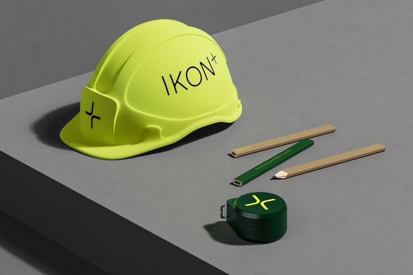
For the word mark, Campbell Hay opted for a customised version of Scto Grotesk A from Schick Toikka. Wai Ming Ng explains how the studio took the clean, geometric sans serif that conveys and introduced subtle curves to soften the overall appearance while aiming to retain its “modernity and confidence”.
Items – the primary typeface – is also from Schick Toikka, as our primary typeface. This modern serif compliments the logotype, adding warmth and approachability and seeking to humanise Ikon’s voice.
The plus sign was added to the logo lockup to highlight Ikon’s collaborative nature. ” They are always there for their client, working together with them and guiding them from start to finish,” says Wai Ming Ng. He adds that it also reflects how Ikon builds relationships with others in the industry.
Outside of the logo, the plus sign is used as a standalone graphic device, as an ownable detail on print collateral or as a sign-off. On a larger scale, it can create solid shapes that can be used with colours or to house images.
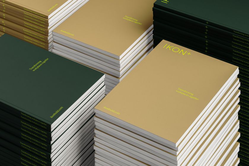

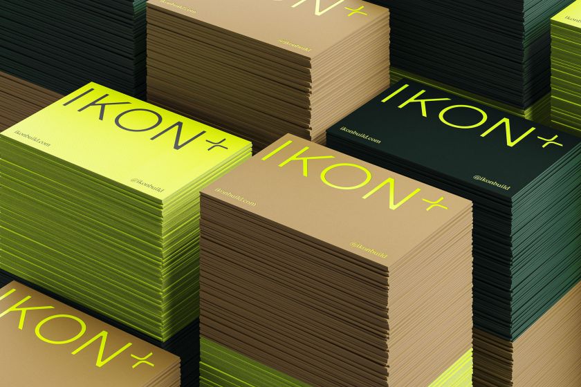
Ikon’s new colour palette, led by rich, dark green, was devised to convey the company’s “dependable nature and forward-thinking approach”, according to the studio. The main hue was chosen for its depth, and Carolyn Ang interprets it as synonymous with “trustworthiness, stability, and strength”.
Beige is also featured in the palette, bringing in warmer tones, while bold accents of vibrant neon yellow inject energy and optimism and seek to signal Ikon’s innovative approach.
“The combination of these colours creates a dynamic yet grounded aesthetic, reflecting Ikon’s duality of being a dependable partner while still pushing the boundaries”, says Carolyn.
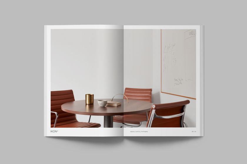
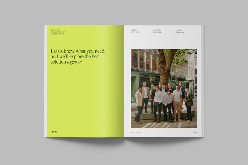
Perfecting the tone of voice of the copywriting was key to positioning Ikon as a trustworthy partner. The copy was written to spotlight the company’s collaborative approach and the needs of its existing and prospective clients.
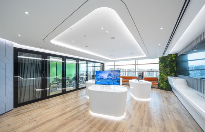
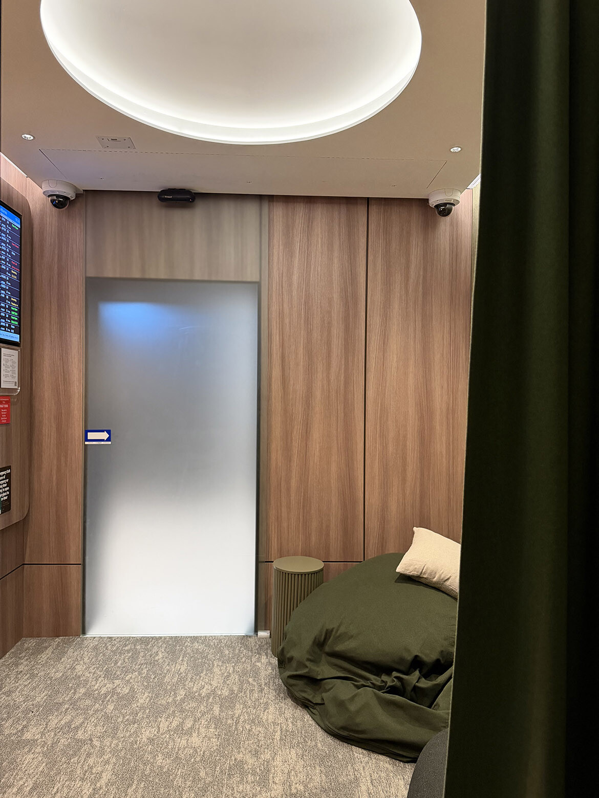
With the art direction, the aim was to highlight the process and people, whether it is film or photography for a specific project or the wider brand photography used on Ikon’s website. When looking at the company’s competitors, Campbell Hay noticed that the project photography is often harsh and cold, using sterile light with little to no styling or people.
Wai Ming Ng says: “What we have focused on with Ikon’s new art direction is using natural light to create softer and more natural-looking images”.
“We also work with stylists on the various shoots and include people in the images adding personality and warmth.”
Related Posts