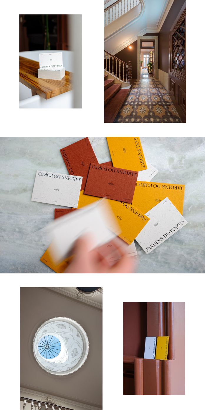
Jardins do Porto is a boutique guesthouse located in the bustling heart of Porto that perfectly blends the original details of a 19th-century bourgeois townhouse with modern-day comfort. The place provides an era of unassuming luxury and captures the essence of bringing the outside in. With welcoming scattered plants, a large skylight, and its greenhouse restaurant Jardineiro, the guesthouse lets natural light flood in, providing a refreshing ambiance to its guests.

A team of talented individuals from 327 creative studio took on the task of creating a fitting brand experience. Their design draws inspiration from the house’s aesthetics, patterns, and textures, resulting in a blend of classic and contemporary styles. The symbol used is representative of the ancient fountain discovered in the property’s garden. To enhance the sensory experience, they opted for GF Smith’s Gmund paper range. This unique paper is crafted using elemental chlorine-free pulp and spent brewer’s grain, lending it a subtle texture.

Below you can see a few images of the project. For more, please visit the website of 327 creative studio or follow them on Behance.

Jardins do Porto Branding by 327 creative studio

All images © by 327 creative studio. Do not hesitate to find more inspiring graphic design and branding work on WE AND THE COLOR.

Subscribe to our newsletter!

The post Jardins do Porto Branding by 327 creative studio appeared first on WE AND THE COLOR.

©

Related Posts

black fireplace and white mantel with large origami starburst made from brown paper. / sfgirlbybayblack fireplace and white mantel with large origami starburst made from brown paper. / sfgirlbybay
color story: basic black.
greetings friends, how are you all hanging in there? i...
Read more
Person using the headway appPerson using the headway app
Get a lifetime pass to Headway and...
TL;DR: Save an extra $15 on a lifetime subscription to...
Read more
Jardins do Porto Branding by 327 creative studioJardins do Porto Branding by 327 creative studio
Xencelabs Pen Tablet Medium Bundle SE Review:...
PROS: Premium build quality and packaging Includes plenty of extras,...
Read more
A photo of a person wearing a blue bulging leisure suit that nestles into the built environmentA photo of a person wearing a blue bulging leisure suit that nestles into the built environment
Designed for Leisure, Sarah Ross’ ‘Archisuits’ Question...
All images © Sarah Ross, shared with permission Among American cities, Los...
Read more
Jardins do Porto Branding by 327 creative studioJardins do Porto Branding by 327 creative studio
Bamboo Coworking Offices – Royal Oak
Synecdoche Design Studio delivered a wide array of workplace options...
Read more
Jardins do Porto Branding by 327 creative studioJardins do Porto Branding by 327 creative studio
Brilliant or bizarre? This travel case comes...
Whether you want to ride around the cityside or have...
Read more