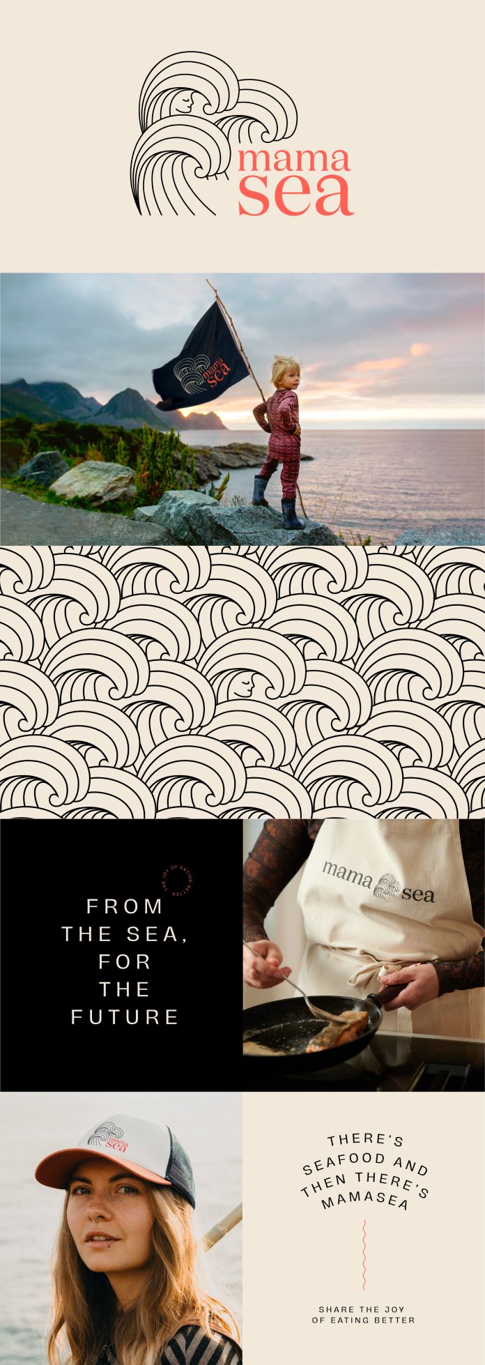
Commissioned by the Eide family, crafted a branding scheme for that included the name, positioning, and visuals. The goal was to develop a seafood brand that exudes passion – which they achieved by creating an aesthetic that exemplifies love and care in tandem with unparalleled flavor and quality.
With three generations of Norwegian salmon farming, the Eide family has always been progressive and forward-thinking when adapting to new technologies. Their main priority is their respect for nature; so it was only fitting that the brand represented this same ethos. We created a unique indie brand with an open mind toward innovation in order to break from conventional seafood aquaculture standards. The result? A modern vision for the future of sustainable fish farming!
This beautiful Japanese-style tattoo illustration and the lifestyle cues it evokes create a cozy and inviting atmosphere. Truly befitting for a brand committed to preserving our oceans and ensuring safe living conditions for generations ahead.
All images © by Fitzroy Amsterdam. Check out the and categories on WE AND THE COLOR for more inspiring work.
Subscribe to our newsletter!
The post appeared first on .
Related Posts