Owen and Tori Phillips-Walmsley of Oat Studio explain how they helped bring a British cocktail brand to life and attract more attention on the shelf.
Kiki is a brand of bottled cocktails founded in southeast London by brothers Tommy and Bob, who shared a passion for mixology and a desire to bring high-quality cocktails to people’s homes.
But after launching, they found their bottle labels didn’t have the required impact to grab attention on a crowded shop shelf. So last year, they approached , a London-based, multi-disciplinary studio founded by award-winning designers Owen and Tori Phillips-Walmsley, to rebrand their identity and packaging.
“Following a lengthy stage of market research and competitor analysis, we defined an area where Kiki could make a big splash in a competitive market,” explains Owen.
“The previous packaging designs featured some great illustrations but were used in an overly complicated design with a low-contrast, muted colour palette. The previous design studio had prioritised the illustrations, and whilst they were great, it meant that the brand’s logo was relegated to the side of the bottle and not visible on a shop shelf.”
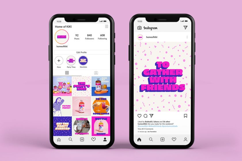
These initial learnings, including customer feedback, formed the basis of the new design brief. But Oat Studio didn’t want to throw the baby out with the bathwater. “We were keen to continue using the illustrations, as they were a unique and easily recognisable asset, and we knew that if used correctly, they could have great value,” says Tori.
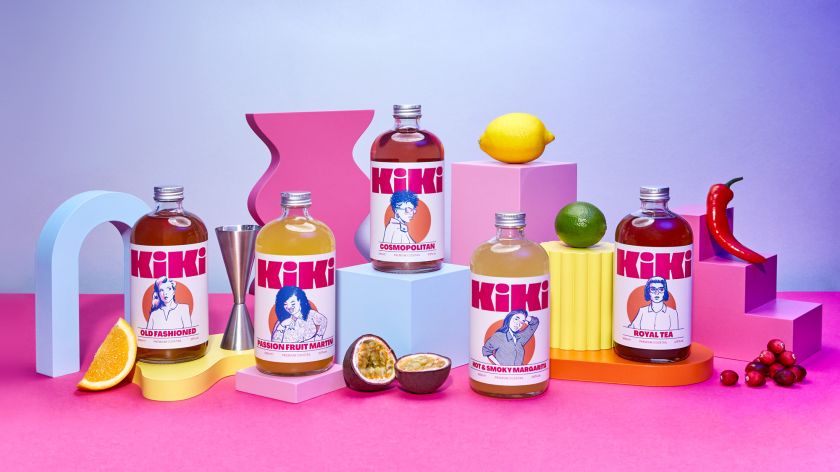
“In redesigning the packaging, we focused on gaining maximum impact from a distance. This meant stripping back the label design to its purest elements – logo, illustration and product name.”
Concept of sharing
The brand’s name, Kiki, is a slang term that originated in America’s gay black culture and which was made famous in the song ‘Let’s Have a Kiki’ by the Scissor Sisters. “It’s loosely defined as a gathering of friends for the purpose of gossiping and chit-chat, which fitted with the idea of sharing cocktails anywhere, from a house party to a picnic in the park,” says Owen.
“Social gatherings were represented by illustrations of various people; the founders have a cocktail bar in London, so the characters were all based on their regular customers. The full set of illustrations includes ten men and women, but they felt strongly about launching with the first five cocktails represented by the female characters.”
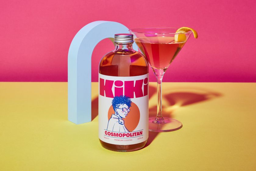
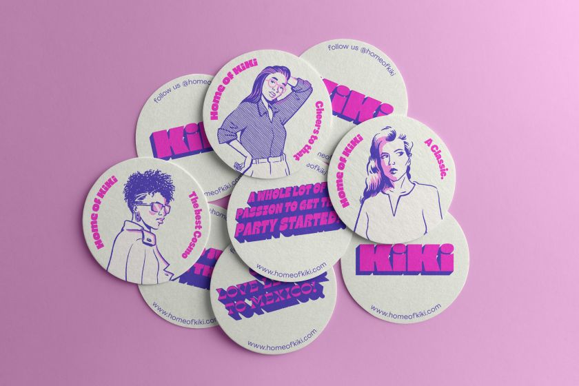
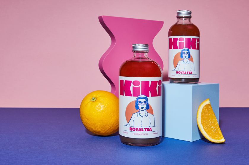
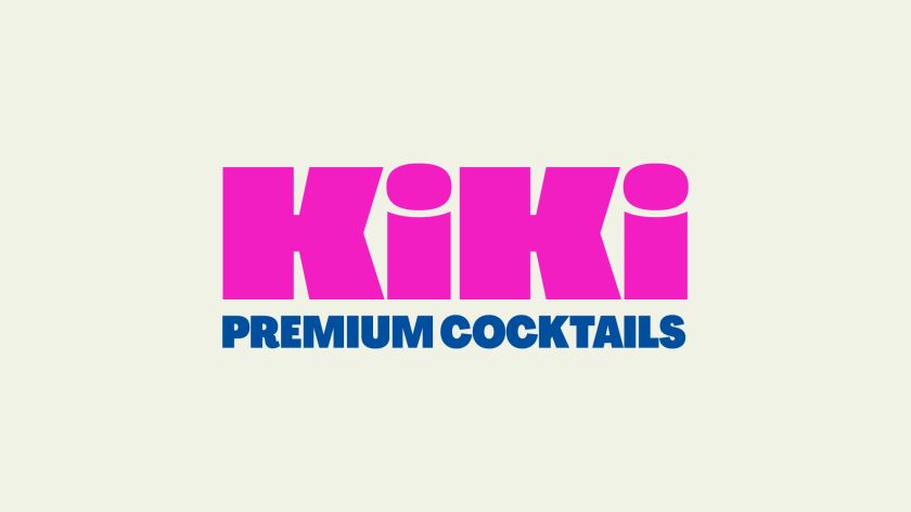
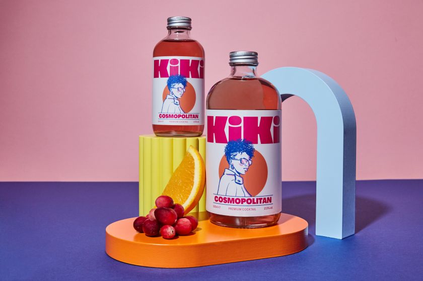
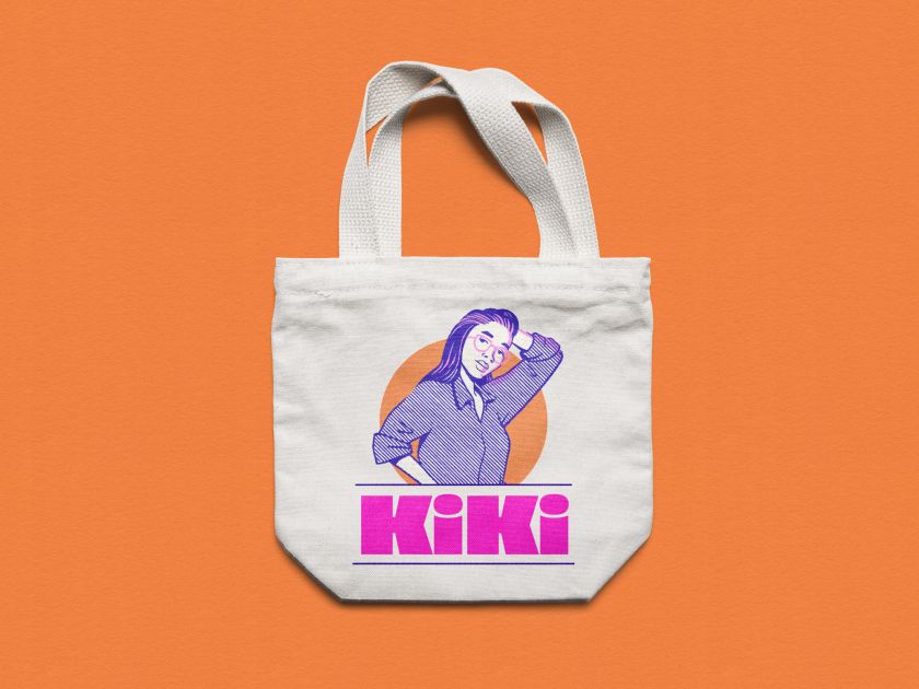
Oat Studio created a curvy and characterful logotype to expand on this fun concept, and the chunky letterforms were designed to fill the space at the top of the label. The looser illustrations overlap the bold new logo, much like a model might interact with a fashion magazine’s masthead.
“We also introduced a bold and playful supporting typeface, the cheeky kicks on the ‘R’s providing bags of personality,” adds Tori.
Punchy colours
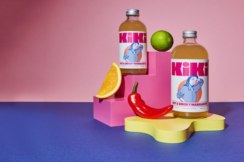
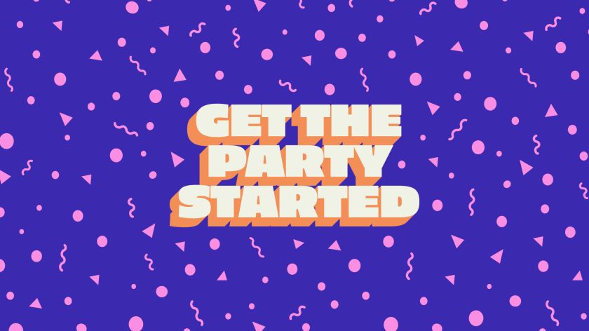
One of the biggest learnings from the previous packaging design was that they needed to use colour to make the cocktail packaging jump off the shelf. “A lot of competitors were using black as a base colour, which, although looked good in the hand, looked lost on a dimly lit retail display,” says Owen. “In opposition to rival brands, we wanted the colours to feel warm, welcoming, punchy and fun.”
“Using a distinctive hot pink, bright orange and deep blue sparingly on an off-white base, the high-contrast palette gave us the impact needed whilst retaining a fresh and premium feel,” adds Tori.
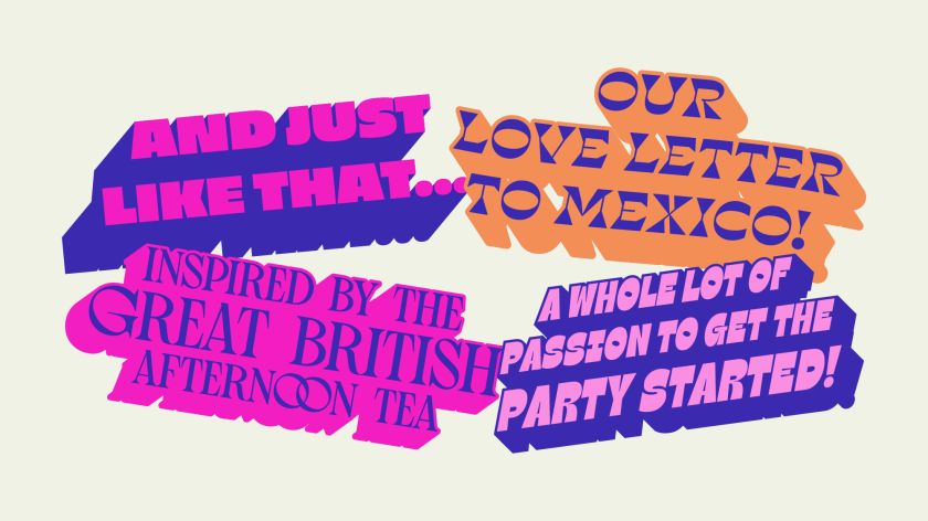
To extend the informal, conversational feel of the Kiki brand and further identify the different cocktails, they each have individual typographic slogans which can be discovered on picking up the bottle. For example, the Cosmopolitan has a Sex and the City reference, ‘And just like that…’, helping cement the brand’s light-hearted character and creating great content for social media.
It all adds up to a unique and engaging brand for Kiki that perfectly captures its playful fusion of company, conversation and cocktails, featuring illustrations by Nathan Brenville and photography by Dav Stewart.
Related Posts