Shanghai Me Branding by DutchScot

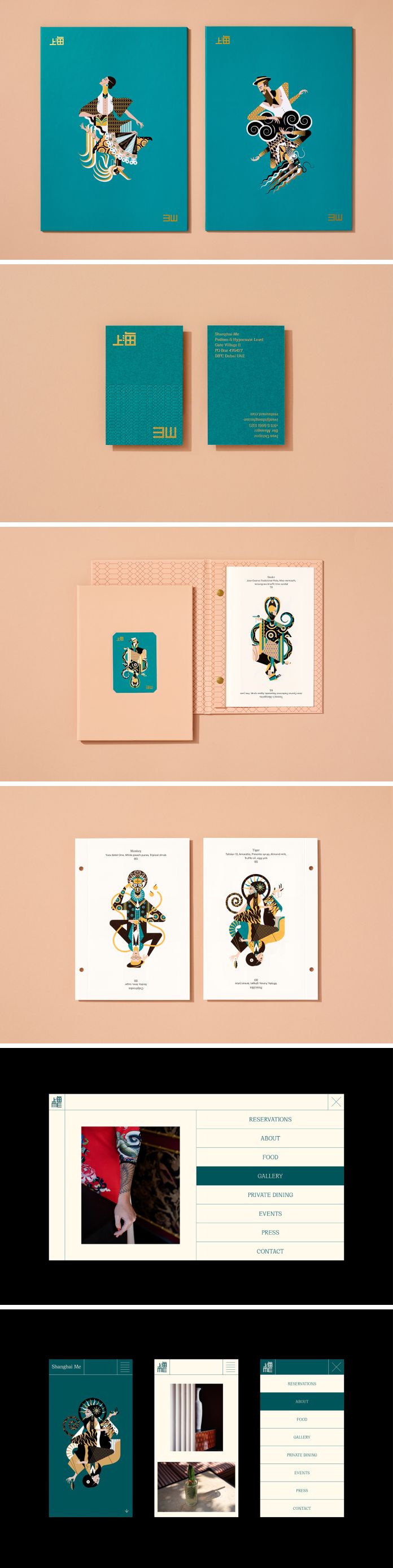
Step back in time to the bustling Shanghai of the 1930s with Shanghai Me – a melting pot of diverse cultures, cuisines, and personalities. It was a place of indulgence and prosperity where even lowly chambermaids could transform into princesses. To create a fitting brand identity, DutchScot was commissioned to work its magic. Drawing inspiration from the glamour of the art deco era, the brand celebrates the idea of transformation with a set of playful dual characters. Each character has a surreal Shanghai Me alter ego inspired by a Zodiac animal, with 12 unique personalities brought to life by illustrator Jonny Wan.

The cocktails at this establishment have an alter ego concept, with two versions of each drink: the classic recipe and the Shanghai Me twist. The dessert and lunch menus feature abstract animal print patterns that match the main illustrations, while decorative linings incorporate the same design. The wine menu showcases a black leather cover with a foiled art deco-inspired illustration of the iconic Shanghai skyline.

Below you can see only a few images of the new brand identity. For more, please visit DutschScot’s website or follow them on Behance and Instagram.

Shanghai Me branding by DutchScot

All images © by DutchScot. Don’t hesitate to browse through the Graphic Design, Branding, and Web Design categories on WE AND THE COLOR for more inspiring work.

Subscribe to our newsletter!

The post Shanghai Me Branding by DutchScot appeared first on WE AND THE COLOR.

©

Related Posts

Maud Madsen’s Oil Paintings Explore Childhood Memories, Daydreams, and NestingMaud Madsen’s Oil Paintings Explore Childhood Memories, Daydreams, and Nesting
Maud Madsen’s Oil Paintings Explore Childhood Memories,...
Brooklyn-based artist Maud Madsen delves into what it means to...
Read more
Shanghai Me Branding by DutchScotShanghai Me Branding by DutchScot
The Audemars Piguet Museum immerses visitors into...
Designed by Atelier Brueckner, the Musee Atelier Audemars Piguet gives...
Read more
Shanghai Me Branding by DutchScotShanghai Me Branding by DutchScot
This Kid-Safe Drone Looks Like a Frog...
Most consumer drones look and feel intimidating to a child....
Read more
Minimal Studio used recycled produce crates to create the illuminated ceiling installationMinimal Studio used recycled produce crates to create the illuminated ceiling installation
Minimal Studio Illuminates a Brutalist-Inspired Supermarket with...
With harsh lighting, a pragmatic layout and no real discernible identity...
Read more
Shanghai Me Branding by DutchScotShanghai Me Branding by DutchScot
Structural side table adds a bit of...
Tables are designed to be stable, or at least they...
Read more
Shanghai Me Branding by DutchScotShanghai Me Branding by DutchScot
From student winners to new directors, dynamism...
Nexus (n.) from Latin nectere, to bind a connection point; a...
Read more