
.
should you be looking for a design palette that’s easy on the eyes, warmly welcoming, and never goes out of style — it’s the naturals. i can’t get enough of these camel-hued textiles, and warm woods — it says minimal without saying stark. add an extra element of depth by throwing in some bright eye-catchers and warm textures like moroccan rugs, tiling, or well-hung art. supported by clean white surroundings it gives accents every opportunity to stand out and make a statement — natural beauty is in!

; .

.

.

(above + below).


; .

.

; .

.

; .

.

; ; ; and .

.

.
Related Posts
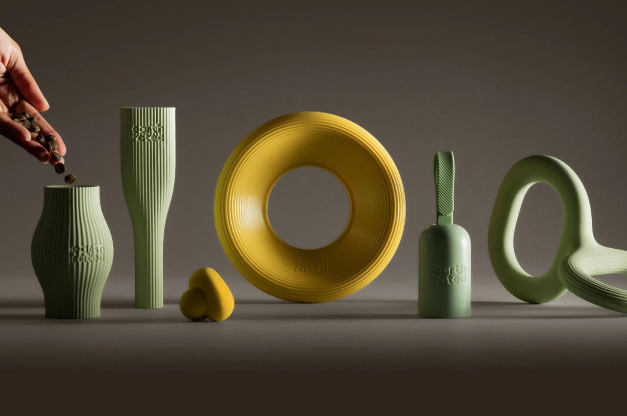
Canadian dog brand Earth Rated has embarked on a transformative...

All images © Lazar Gintchin, shared with permission
Photographer Lazar Gintchin...
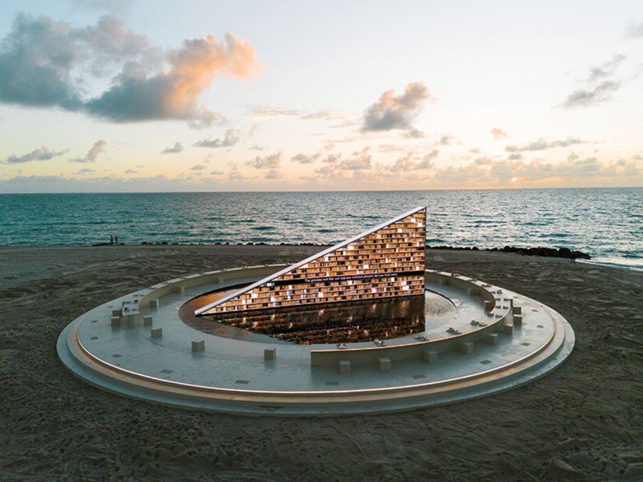
On the sands of Miami Beach, where the horizon usually...
A simple, bamboo plate gets a complete makeover thanks to...
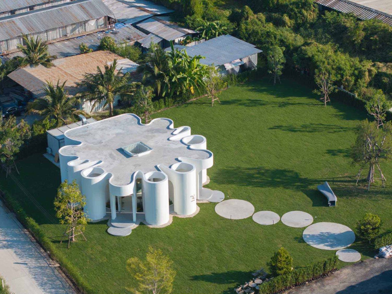
Tucked away in the industrial landscape of Bangkok, Curvy Dining...

Artificial intelligence and machine learning have become such hot topics...