The internet sure has a short memory. It’s barely been 3 months since Apple debuted the Vision Pro and it pretty much looks like we’ve entirely forgotten about it. However, people experimenting with the developer kit seem to be incredibly impressed with its underlying tech (some even let out when they tried the Vision Pro out). So while the hardware device is still a while away from officially hitting the shelves, it’s safe to say that developers are excited to build spatial-ready versions of their apps, platforms, websites, and games. Earlier last month we looked at an for the Vision Pro, and it seems like we’ve now got a taste of what Instagram would look like through Apple’s headset.
Designer: Ahmed Hafez
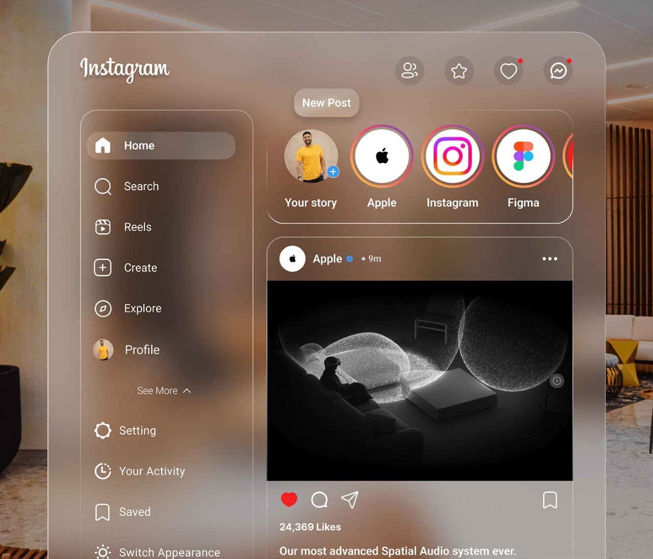
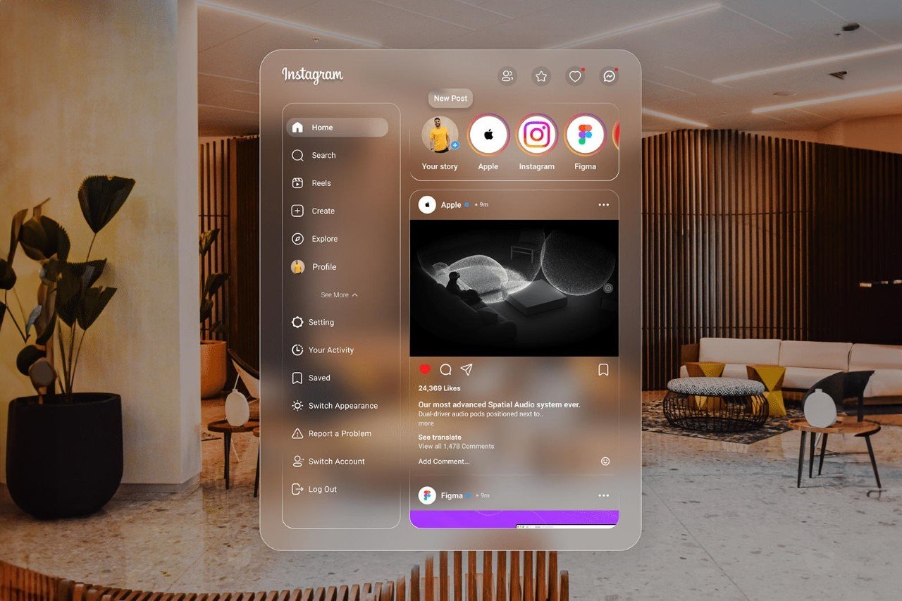
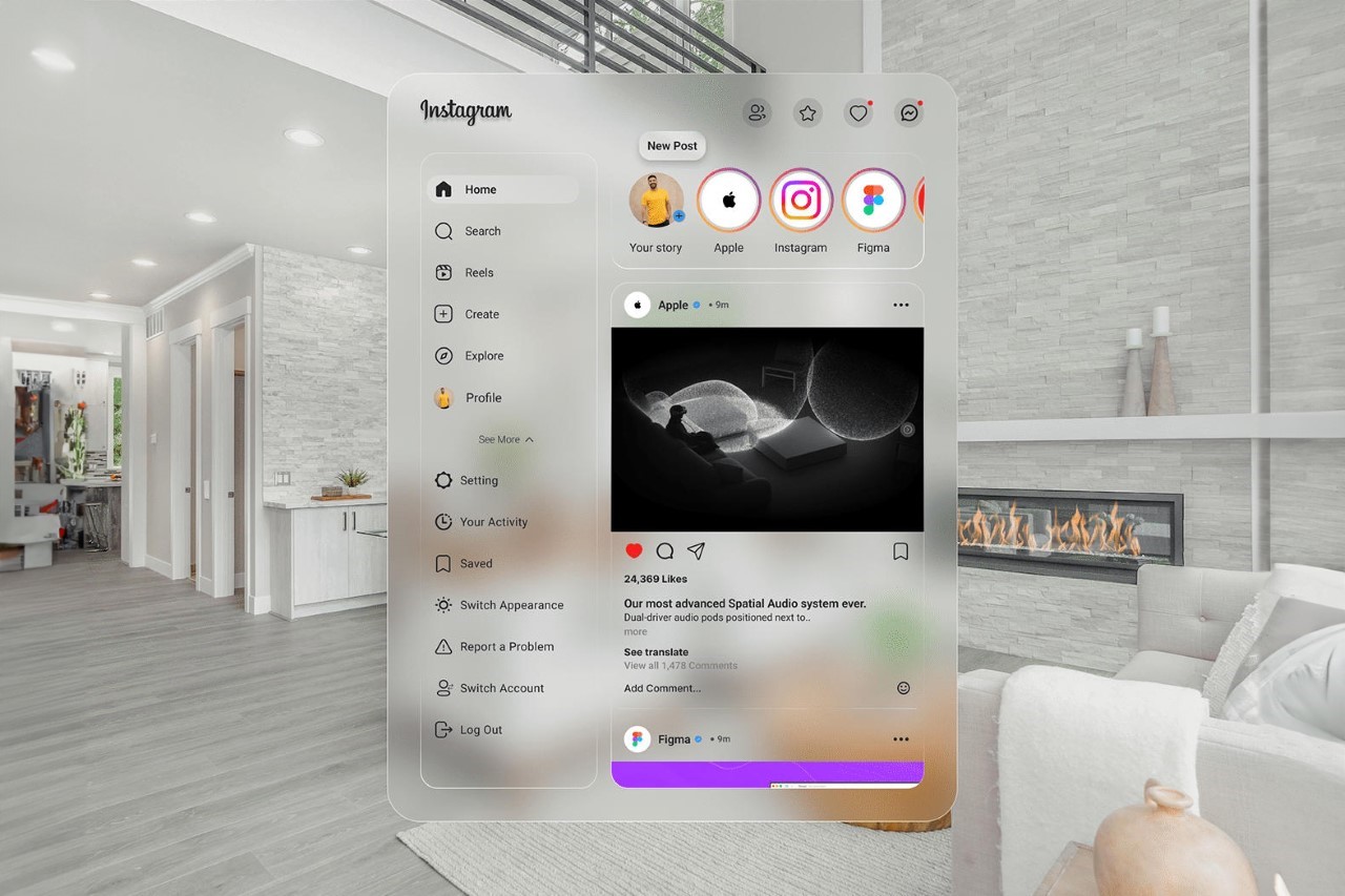
Visualized by Cairo-based designer Ahmed Hafez, this Instagram UI comes with neutral frosted glass elements that allow the content to stand out against the background. This approach works rather wonderfully in the spatial world as the contrast allows you to easily see text and elements whether you’re in an illuminated space or even a dimly lit one. Theoretically, it looks like Apple may have ended the “light-mode/dark-mode” UI debate by just making everything frosted.
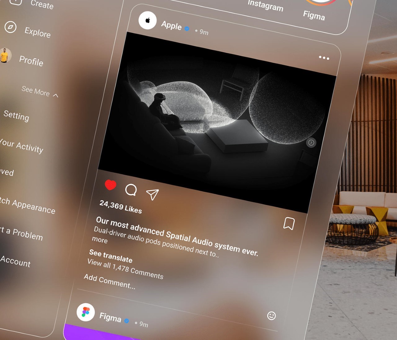
The interface looks a lot like Instagram’s desktop (and even now its iPad) interface. It’s wider than its mobile counterpart, and comes with menus on the left and content on the right. You can view stories on the upper carousel, or even move higher up to access follow requests, close friends, notifications, and DMs.
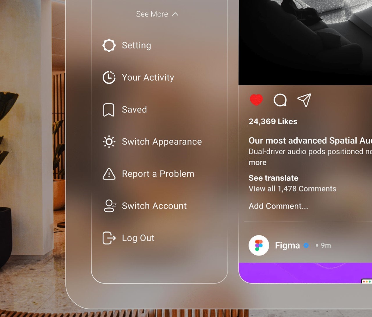
The fix for the light vs. dark issue is present in the interface too. While the glassy elements don’t change color, you can alternate between white or black text for better visibility. The interface, however, isn’t traditionally landscape. It’s still quite vertical, which is perfect for spatial computing because you can merely move it to the side and have other tabs/apps open – a promise that Apple made rather clearly with their WWDC keynote.
The Vision Pro is still at least half a year away from formally being available to consumers, although rumors say that Apple’s seeing quite a few roadblocks with its production and plans on cutting the number of production units drastically from its original down to 150,000. That being said, the company isn’t giving up on the idea any time soon, and the Vision Pro is mainly paving the way for a Vision Air device that will be much more affordable. Before that happens, though, it’s important for developers to create a strong app ecosystem to justify the shift from physical computing to spatial computing. This fan-made IG interface is the first step in that direction!
The post first appeared on .
Related Posts