Credit: Chichester Festival Theatre / Rose
London-based design agency has given one of Britain’s most beloved arts institutions a fresh visual identity that shows off the theatre’s legacy and ongoing relevancy with modern flair.
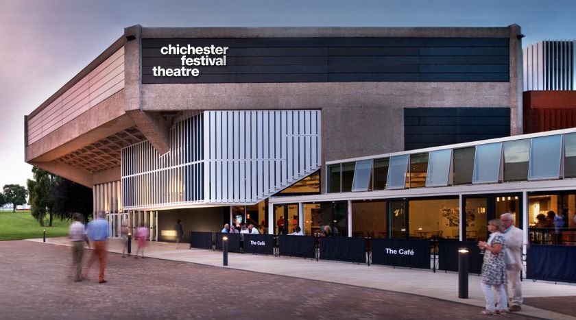
opened in 1962 as Britain’s first modern thrust stage theatre. Its first artistic director was the British legend Laurence Olivier, and Chichester Festival Theatre formed the basis for his newly established National Theatre company. Funded and built by and for the Chichester community, CFT has since cemented its formidable reputation within the theatre world for the quality of its work on and off stage.
After sixty years of operation, it was time for a change – the theatre’s team felt its brand identity no longer reflected Chichester Festival Theatre’s quality, reputation or heritage and was hindering them from delivering exceptional and consistent experiences in every aspect of its work.
Cue Rose. The agency is no stranger to working with theatres – its client list includes London’s Old Vic, Hampstead, and Gate theatres. Chichester Festival Theatre enlisted Rose’s expertise to help the theatre become visually stronger, more recognisable and memorable, and more inviting and accessible to existing and future audiences of all ages and backgrounds.
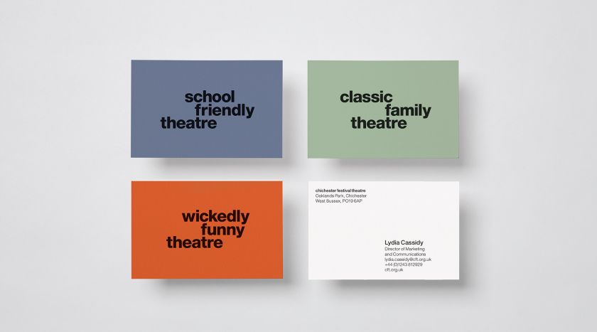
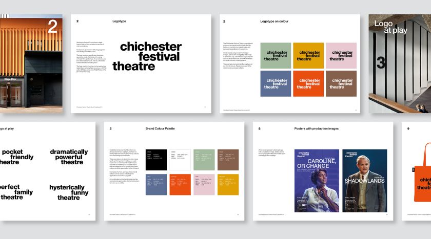
The first challenge for Rose was reinstilling a strong sense of brand equity in the theatre’s name. Due to the length of the name, those close to Chichester Festival Theatre have become accustomed to affectionately referring to it as CFT over time. But it was also keen to ensure new audiences wouldn’t be confused by initials which didn’t mean anything to them without explanation. Thus, Rose’s solution for the theatre’s logotype spells out the name in full whilst ensuring its more familiar initials are always at its heart.
Credit: Chichester Festival Theatre / Rose
Credit: Chichester Festival Theatre / Rose
Credit: Chichester Festival Theatre / Rose
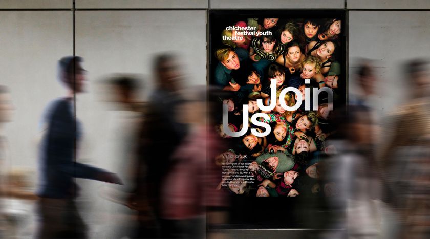
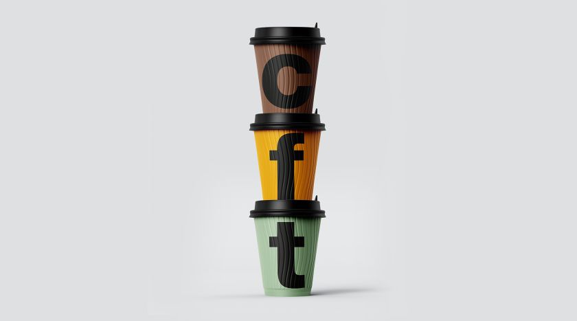
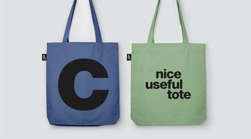
The new logotype plays with negative space and flexes in motion to connect the theatre’s name with its most iconic productions and talent. “We created a series of playful key messages that adopt the same visual approach as the logo to convey the rich and varied types of theatre and experiences on offer, but also the wealth of talent who have helped establish and build CFT’s reputation over six decades,” says Simon Elliott, creative partner at Rose.
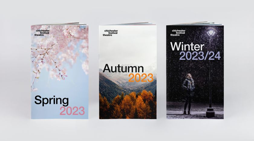
The new identity boasts a new colour palette inspired by the theatre’s architecture and location. Helvetic Neue – which the theatre used in its original brand identity from 1962 – has been revived for the 2023 identity. This return to form celebrates CFT’s heritage with a simpler, more confident visual language.
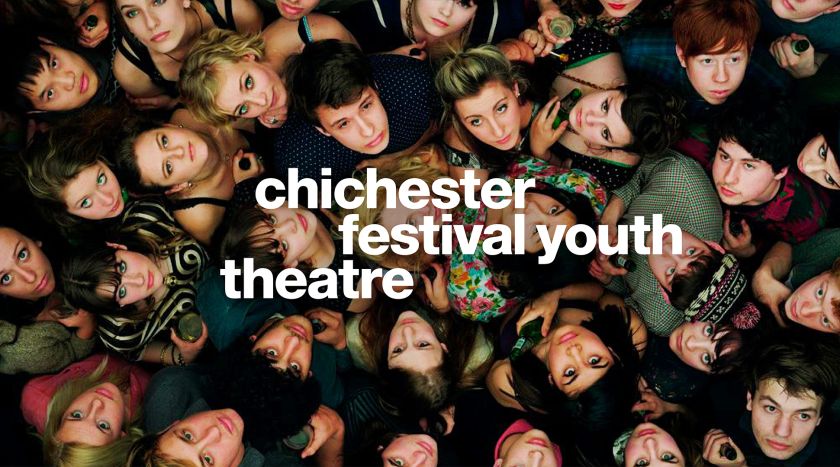
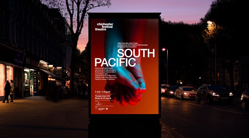
Rose also created a simple framework and typographic system (reflecting the asymmetry in the new logo) for CFT’s marketing to encourage greater brand recognition and continuity with audiences. Meanwhile, imagery and art direction have been paired back to reveal a stronger and more distinctive approach to storytelling through photography.
Credit: Chichester Festival Theatre / Rose
Credit: Chichester Festival Theatre / Rose
Credit: Chichester Festival Theatre / Rose
Credit: Chichester Festival Theatre / Rose
The visual identity is underpinned by a brand strategy via the global verbal branding agency , which also developed the theatre’s warmer, more inviting new tone of voice.
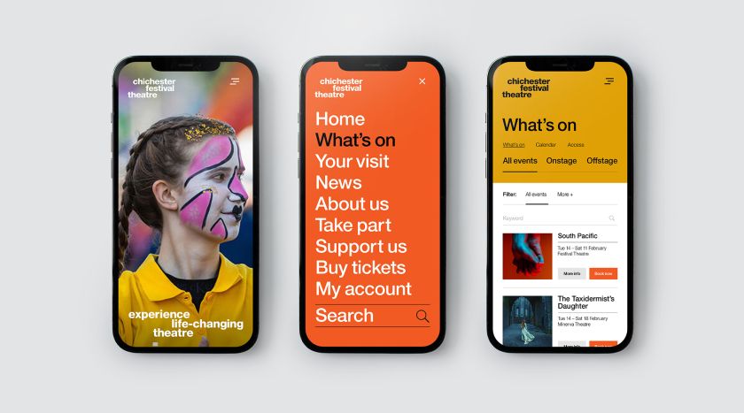
Finally, a new website for Chichester Festival Theatre, designed and developed by , strips down the theatre’s previously overcomplicated online presence. The new site offers a simpler, clearer and easier-to-navigate experience which is more accessible to new and younger audiences.
Rose’s Simon Elliott adds: “CFT is a local theatre with a world-class profile. It’s been a privilege to work with another British cultural institution with such a distinguished story and heritage and help it deliver exceptional experiences that unite its community and audiences.”
The new brand launched in February, alongside the Theatre announcing its much anticipated 2023 season.

Credit: Chichester Festival Theatre / Rose
Credit: Chichester Festival Theatre / Rose
Credit: Chichester Festival Theatre / Rose
Related Posts