


Under the principle adage — beauty is everywhere, -based architects amplify the experience of makeup inside beauty retailer Harmay’s latest establishment in Hangzhou. Nestled neatly on the first floor of a mixed-use office building, the architects have reimagined the world of makeup within a quirky office layout.
Unlike the conventional beauty store where each branch is consistent in interior, each of Harmay’s retail is conceptually unique yet consistently linked together with a futuristic undertone (see some of their other stores , , and ). Unlike other AIM’s Harmay stores heavy in metallic and industrial tone, this newly revamped office floor is paved with 70s nostalgia of lime , summer and dotted with unmissable dark veneer and embossed panels. With the floor area of near 1,400 square metres completely encased in a curtain wall, the colours become a showstopper on the street façade of muted whites and greys.
Related:


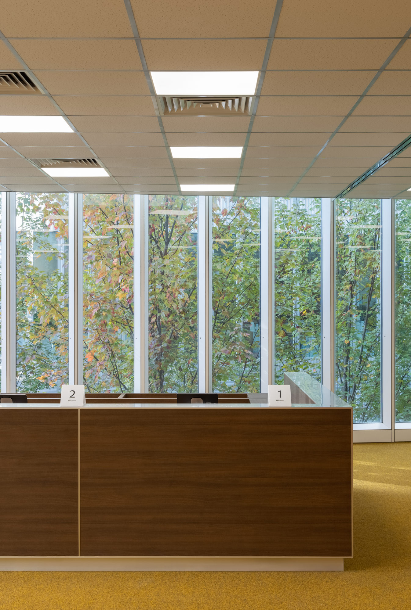
Travelling up the silver staircase from ground to the first level unfolds an organisation of desks in a grid-like manner. Among the sea of burnt orange carpet lies individual lemon-yellow coloured desks installed with deep product trays. Areas that would normally have big rolling compactus are substituted for timber shelves coated in lime used for product display. Both shades are strategically selected to contrast or compliment colours commonly used in beauty product packaging. Undeniably the favoured grid layout (also seen in AIM’s other Harmay stores) strongly points to a romantic interpretation of the vintage futurism.
Scattered around the office grid are glass doors that semi enclose areas representing meeting rooms. The curation catalyses a shift of muted colours, with the carpet becoming mossy green, while the display table is made of darkened timber.


In contrast, the central office core is covered in orange textile, with ribbon of circular windows punctured through for customers to have a glimpse into Harmay’s internal transit warehouse—a core part of their brand identity. One face of the core also features a series of quiet booths in green for a privatised product appreciation. Should customers walk past the phone booths, they may find themselves suddenly surprised by a hall of infinite mirrors delivering a makeshift transitional futuristic journey, before finding themselves back in the office area. The material change reverberates Harmay’s overarching futuristic theme.
Texturally arresting and interactively tactile, Harmay’s Hangzhou Store invites cosmetic enthusiasts to fall in love with the beauty of everyday spaces. It’s definitely a step in a different direction to the previous Harmay flagships in Hong Kong and China, however, it serves as a welcoming gesture that will challenge the language and future of cosmetic .
Related:
[Images courtesy of . Photography by .]
| The article appeared first on . |
Related Posts