The brand and design consultancy refreshes and simplifies British Land’s logo for a modern take that hints at community and a sense of place.
Logos should represent a brand’s identity and mission, which is why UK property company British Land needed a change. The old motif was a silhouette of a person with the Union Jack flag emblazoned across its chest, but it seemed dated and lacked the connection between its architecture and community.
Brand and design consultancy studio DixonBaxi was brought on board to refresh and modernise the design to evoke the company’s focus on creating outstanding places for people to work, live and visit – as per its mission statement.
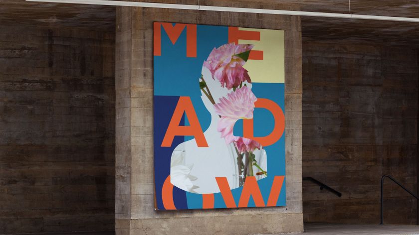
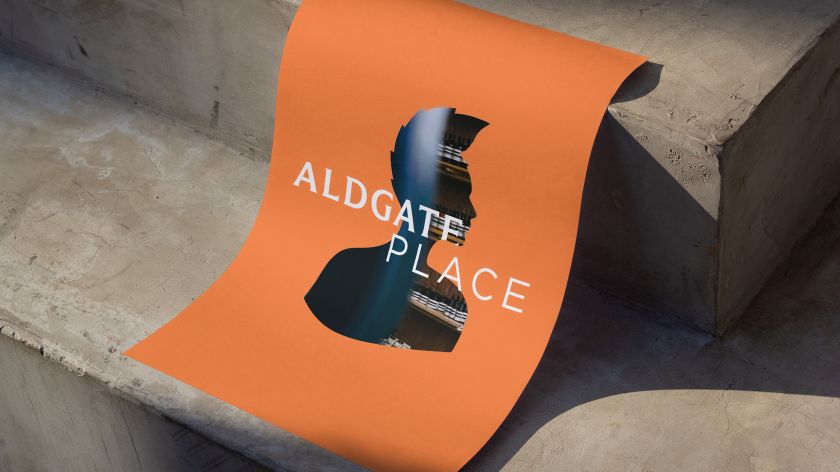
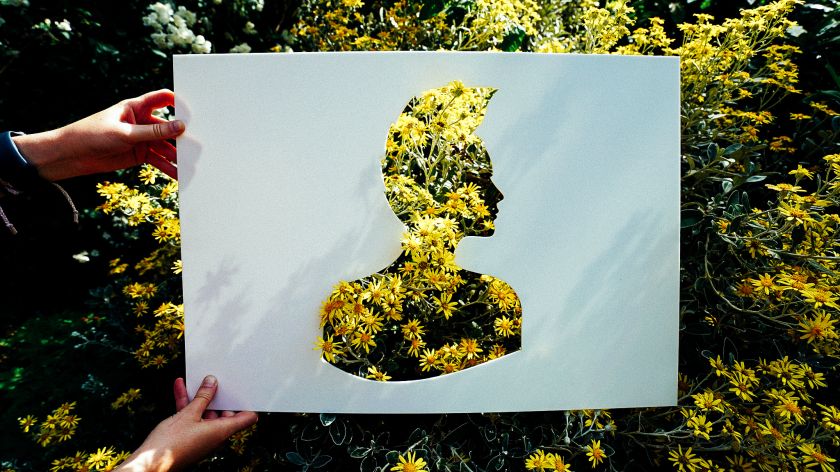
Tasked with simplifying the logo and creating something adaptable and stylish, the new motif incorporates elements found in its predecessor while upgrading the look to include its vibrant neighbourhoods within its silhouetted shape.
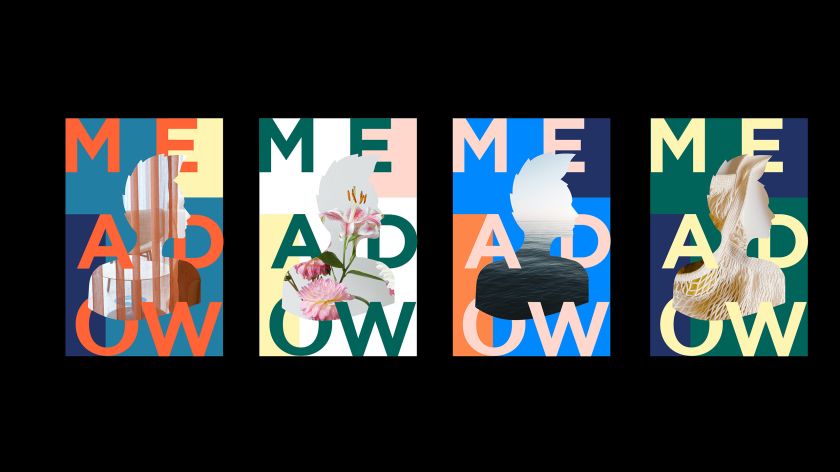
“The icon was hiding in plain sight, and once liberated, we were able to give it new meaning and celebrate it in a modern way,” says Hollie Sanderson, designer at DixonBaxi. “Moving from distant and corporate to being more human scale, approachable and integrated.”
These outlines present a photographic snapshot of the communities that British Land works in, creating a more moving and evocative sense of the company’s work.
In line with British Land’s renewed focus on sustainability, innovative products and services, this new visual approach embodies the brand’s new strategy. It helps to position British Land as a market leader in real estate, including its ability to resonate with different audiences.
“DixonBaxi has worked closely with us to evolve the brand so that it better reflects British Land’s strategy,” says Katie Mansfield, marketing director at British Land. “We now have a consistent approach that highlights the diversity and vibrancy of our places. They have cleverly developed a new framework that enables us to maintain our stamp of quality while providing a range of expressions to draw in wider audiences.”
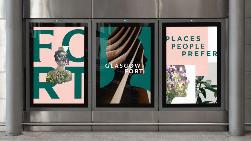
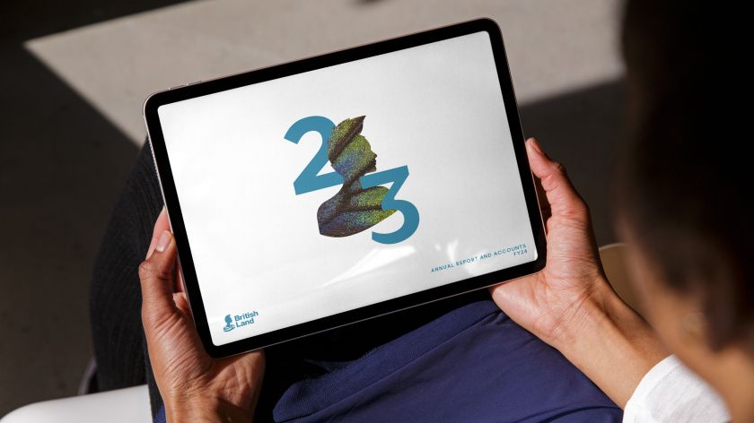
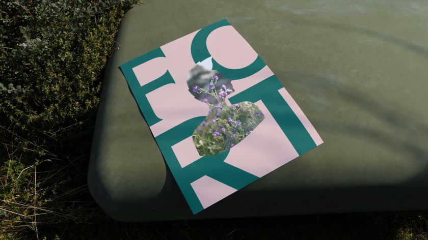
The unification of the brand’s identity was vital, yet creating the overlaid updated logo presented a series of challenges, including how to meet the varying expectations of investors, customers and local communities. The goal was to create a sense of trust in the company, so adopting a vibrant and expressive visual aesthetic was decided, which could be easily rolled out and adapted across assets.
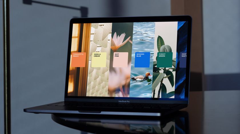
Using beautiful, well-lit images of buildings and varying natural palettes – inspired by British icons – to create the layered compositions, the team created brand frames that offered glimpses into life across British Land’s properties, anchored in its history.
The use of the paired serif ‘ABC Arizona’ and sans serif ‘Gotham’ works to create duality and highlights the company’s embrace of new and old, plus craft and reliability.
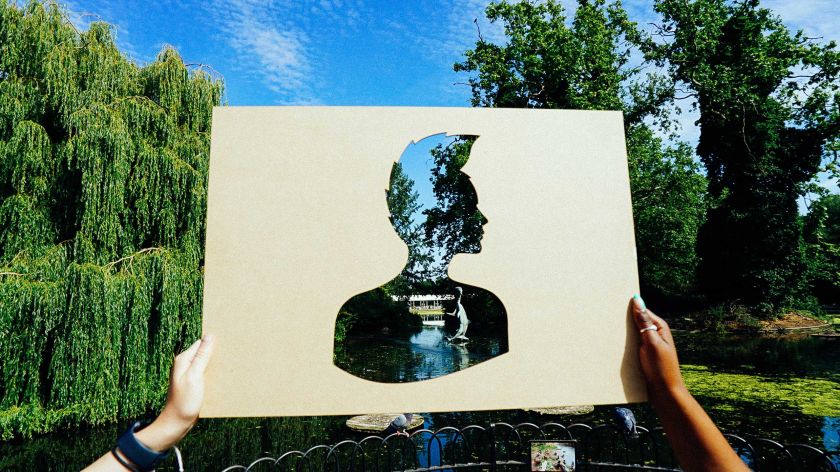

“Bringing warmth, simplicity and modernity to the British Land brand was a fine balance,” Karun Agimal, design director at DixonBaxi. “Take it too far, and it could lose its iconic and deeply trusted qualities. Not far enough, and it wouldn’t capture the agility of the business or its bold ambitions for a more inclusive and integrated future for neighbourhoods.”
Related Posts