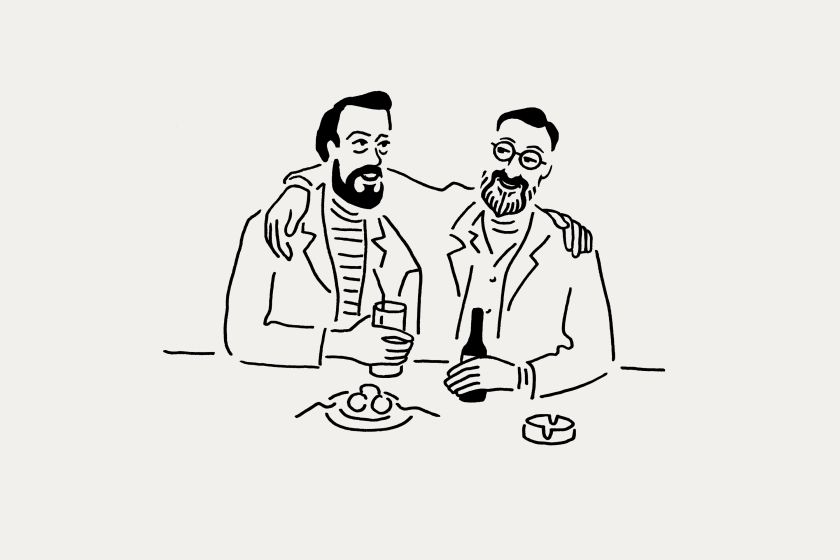
Porteños (“people of the port”) captured going about their day in Buenos Aires. All illustrations by Rebecca Sutherland.
This central London restaurant, led by Argentine Fernando Trocca, has an inspiring back story. DutchScot put it front and centre of their new branding for the enterprise.
When choosing somewhere to eat, you’re looking for decent food, a nice atmosphere and affordable prices. But in central London, there are many good places to choose from. A successful restaurant needs to do a little more to stand out.
Customers love hearing about a venue’s back story: what inspired its owners to launch it in the first place and what’s behind the menu it offers. And it’s the job of branding to share that tale in a way that both lures punters in and makes them feel part of its continuing story.
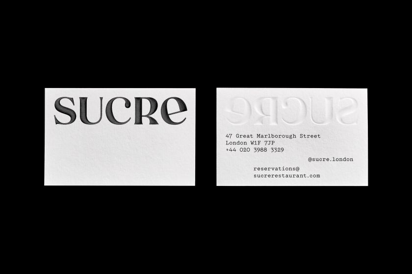
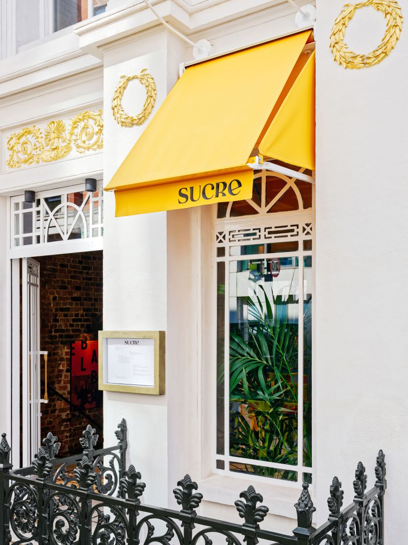
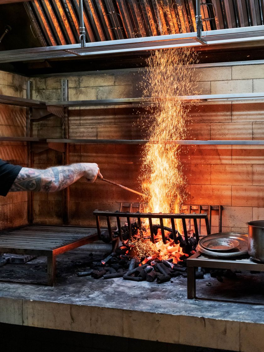
Here’s a great example crafted by , a design and branding consultancy we’re big fans of, having previously covered their and .
The brief
Headed up by much respected Argentine chef Fernando Trocca, is a restaurant with Latin American and European influences, set within a 310-year-old former concert hall in London’s Great Marlborough Street.
The menu tells the story of Chef Fernando Trocca’s immigrant background and the European adventurers who crossed the Atlantic to make their home in his native Argentina. The wine list makes the same trip.

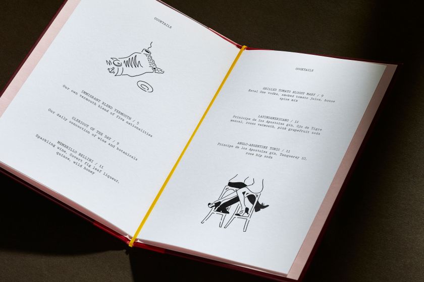
Bottling the journey from Old World to New, and the mingling of new grapes and makers who poured into the land, passing their secrets down the vine of different family generations.
When DutchScot were asked to craft a fresh visual identity for the restaurant, they came up trumps.
The branding
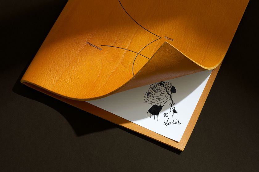
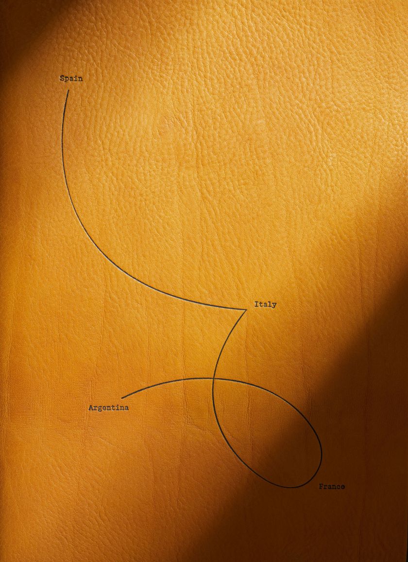
The movement of people from Europe to South America is displayed on the wine menu cover. This story of immigration informs the wine list itself, with wines being sourced that chronicle the journey.
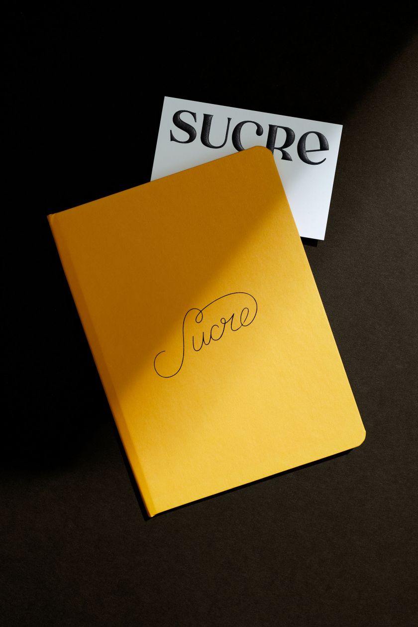
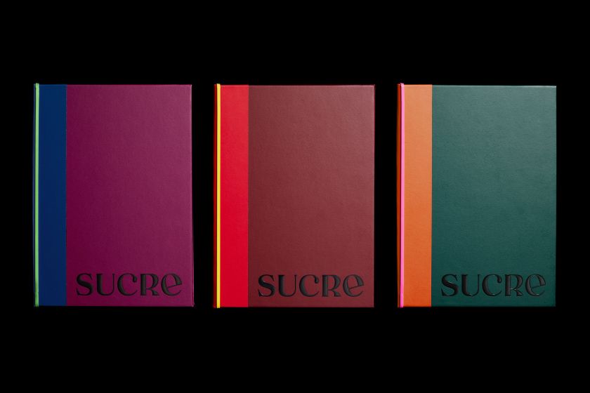
The logo is a union of several Old World references, heritages and influences to reflect the Chef’s and restaurant’s immigrant background, using contradictory and mismatching elements and carefully crafting these into a new unified expression.
Common Argentine tango steps were studied and used decoratively throughout the branding. And the new branding also features illustrations created by : a charming study of the daily life of the people of Buenos Aires.
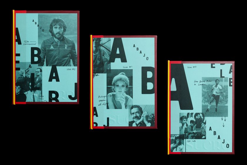
Abajo, a bar by Renato ‘Tato’ Giovannoni, lies underneath the restaurant. Abajo translates to ‘below’ or ‘downstairs’ and is based on the underground spirit of 80s Buenos Aires. Argentina had just left a harsh military dictatorship.
What followed was an explosion of culture and optimism. The Argentinian economy was struggling, so to reflect this, items from Sucre were overprinted in an expression of frugality. The name was represented in the stepped logo and visual language.
Related Posts