The iconic concert hall’s new branding evokes the emotion and eclecticism of its music by majoring in motion and interactivity.
Philharmonie Luxembourg, known officially as the Grande-Duchesse Joséphine-Charlotte Concert Hall, is a prestigious concert hall located in the Kirchberg quarter of Luxembourg City. Opening in 2005, it seats up to 1,500 people and plays host to around 400 performances each year.
Designed by architect Christian de Portzamparc, it’s a stunning building boasting excellent acoustics and an iconic frontage, instantly drawing the eye with its 823 facade columns made of white steel.
The institution’s new visual identity, designed by London-based branding and communications agency , is designed to connect with a new generation of concert-goers by evoking the emotion, experience and the eclecticism of music.
Most notably, the logo takes its cue from the building itself and uses the power of creative coding to pulsate the columns in response to the rhythm of any piece of music. Read on to find out how they developed this wide-ranging and radical identity.

The brief
At the start of the process, Philharmonie Luxembourg explained that it needed to expand its reach past its loyal audience of classical music lovers. To strike a chord with a younger, culturally curious and digital-minded audience, it required a new visual identity that could break free of the elitist connotations attached to classical music and amplify the full diversity of experiences the Philharmonie has to offer.
In collaboration with cultural strategist , NB Studio set out to harness the collective passion of everyone in the organisation, from general director to bassoonist. Based on this research, the team, led by creative director Alan Dye and design director Sam Pittman, developed a new brand platform that champions openness, musical eclecticism and the irreplaceable experience of live music.
The logo
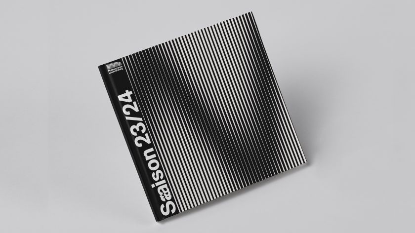
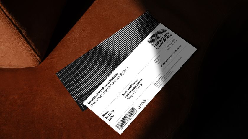
NB’s logo design takes its cue from Philharmonie’s iconic building, an architectural landmark in Luxembourg. But the logo is more than just a depiction of the static monument. In the new design, the vertical columns pulsate in response to the rhythm of the music.
NB developed a bespoke, generative logo animation tool in collaboration with creative coder . Created using a combination of JavaScript, WebGL and Vue.js, the tool generates audio-reactive wave patterns based on any piece of sound fed into it.
This means that the logo can flex and adapt to the music that the audience might hear in concert. The new system places music at the very heart of the brand, whether it’s electro, opera, jazz or classical.
“Creating a connection between the building and the music played within was at the core of our solution,” explains Sam Pittman, design director at NB Studio. “People within Luxembourg and beyond knew the building, but so many had no idea what actually went on inside.
“From the get-go, we knew that we wanted sound to play a major role in the identity,” he continues. “It’s the lifeblood of the Philharmonie, and working with a digital-first mindset allowed us to pair sound with animation, but not in a traditional manner.
“Our generative tool utilises the real-life waveform to drive the animation, bringing the brand to life through music. The tool is a huge step forward in Philharmonie’s digital transformation programme. Every brand exists in the digital world, yet the guidelines of the majority still solely exist for static applications; the tool moves away from this way of thinking.”
Typeface, graphics and animation
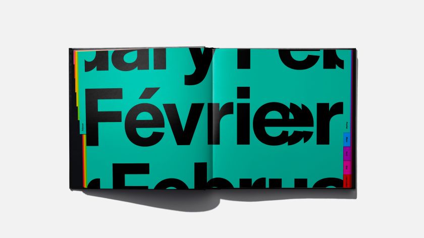
was chosen as the brand’s singular typeface due to its modern yet timeless aesthetic. Running through the new brand identity is a system of lines governed by the logo. These lines inform the brand’s new distinctive typographic treatment.
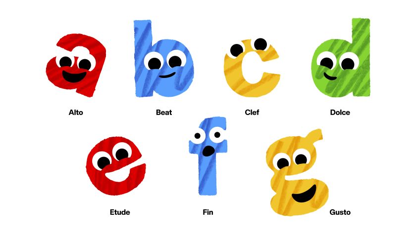
Based on the idea that all music is experienced through vibrations, the letters that make up the musical scale (a to g) resonate across the page or screen. NB created a full suite of resonating letterforms, including the many accented letters required for the diverse set of languages used by the Philharmonie.
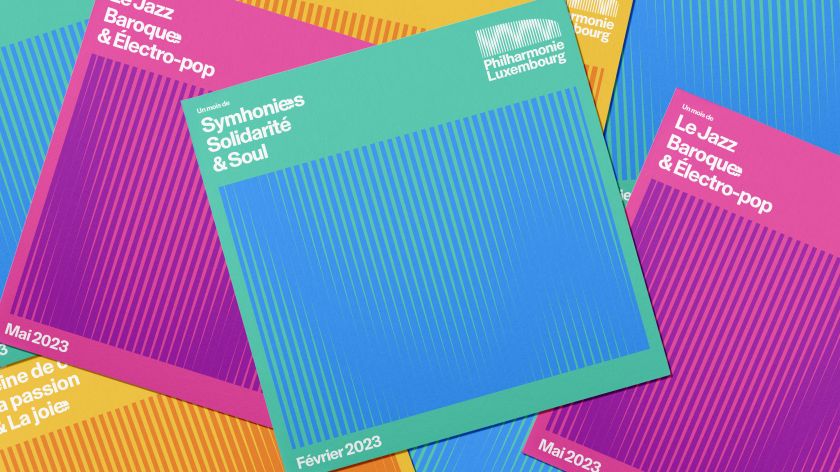
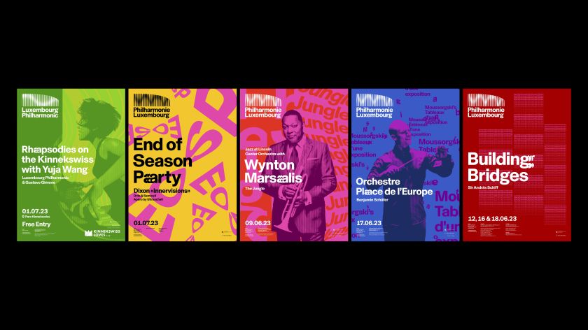
A new graphic system for concert key visuals was also developed, moving the brand away from a pragmatic approach that solely focused on delivering information to a new one which majors on emotion. In each key visual, typography is used to express the feeling and story of a piece of music featured within the concert.
Inspired by psychologist Robert Thayer’s ‘model of mood’, the highlight pieces of music are categorised before being artistically expressed using a combination of typography and colour. For editorial content, NB also created a variety of image treatments based on vertical lines.
Its research found that the target audience was wary of the Philharmonie because of its associations with classical music, which they found to be elitist, daunting and boring. NB’s concept addresses these misconceptions, but with a twist, relating them back to the audience’s lives.
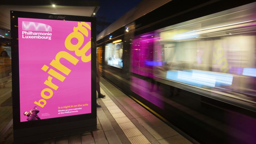
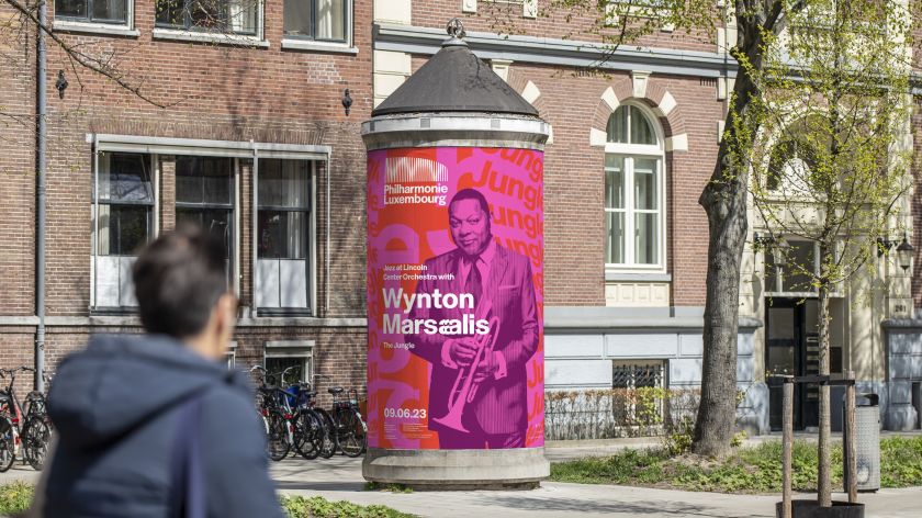
Within the visuals, the misconceptions emanate from the instruments: a tongue-in-cheek visualisation of what the target audience hears when listening to classical music. Brought to life in motion by animated type specialist Mat Voyce, the campaign will live in digital ad spaces at Luxembourg Airport as well as on cultural columns and trams around the city.
To promote the launch of the new identity and capture the attention of the new target audience, NB was also tasked with creating a brand awareness campaign.
Brand architecture and naming
A further important aspect of the new visual identity is that it recognises the Philharmonie is no longer just a hall. Over the years, it’s grown into an organisation with many distinct offerings, including an academy, a children’s offer, a membership programme, an amateur orchestra and various festivals.
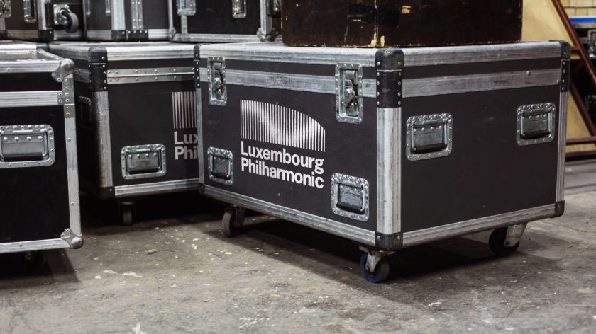
In response to these developments, NB created a new brand architecture which unites everything under the master brand. As part of this process, the resident orchestra, formerly the ‘Orchestre Philharmonique du Luxembourg’, was re-named the Philharmonic Luxembourg.
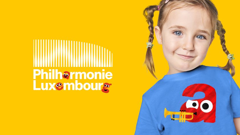
The switch to English creates greater international appeal and helps position the orchestra on a global stage. The new design system is consistent and recognisable but still allows for differentiation. For example, the logo used alongside the children’s offer includes playful letter characters, each with its own distinct personality.
Built for the 21st century
Alan Dye, owner and creative director of NB Studio, pays tribute to the collaborative nature of the project. “Bold, innovative design can only happen if you have a brave client that embraces change,” he says. “The Philharmonie Luxembourg were all of these – they saw the power of a good idea and totally championed our vision creatively, strategically and technically.
“Music makes us all feel differently,” he adds. “It touches our every emotion; it makes us feel happy, sad or contemplative. The Philharmonie is the emotional centre of the city, and music really is the meeting point of cultures, so we wanted to create an inclusive system that meant something for everyone, reflecting the joy and sensibility of every sound.”
Cultural strategist Cecilia Martín adds: “A hyper-connected and resourceful younger generation is making classical institutions worldwide rethink their approach and embrace diversity and equality. It was time to change Philharmonie’s image of classical music away from monotonous images of men in black and white. The 21st century calls for a bold, colourful, vibrant, dynamic, moving and sensorial approach: a visual spectacle that brings to life the richness of each experience. Surprise in every note.”
“What we love the most about the new identity,” says Aliki Zachariadis, head of marketing and digital division at the Philharmonie, “is that it was built for a 21st-century brand that mainly lives in the digital world. As an institution there to share musical experiences, we couldn’t be more pleased to see how NB Studio put music at the core of every design detail and touchpoint they have rebranded. There are no doubts that this new, music-reactive logo will become as iconic as our building.”
Related Posts