The rebrand introduces a simplified communications system, including clearer product naming and universal benefit-led iconography.
Many of us will recognise Wilkinson Sword, a brand with a hint of its 250-year history in its name. It began as a weapons manufacturer in 1772 under a different name before Henry Wilkinson introduced sword production to the company in 1824.
Now, 200 years later, the razor brand is embracing and re-telling its story in a contemporary way, taking its heritage beyond its name with the help of B&B Studio. It correlates with Wilkinson Sword’s desire to cement its role as challenger to sector leader Gillette in the face of new market entrants and direct-to-consumer offerings.
From a brand and design perspective, much more could be done to communicate its origins in the sword-making industry, as consumers were not aware of this fact. This reinvigorated pride in its history is underpinned by its new brand positioning: The Blade Masters since 1772.

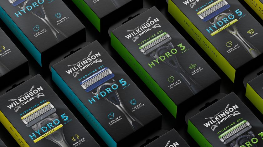
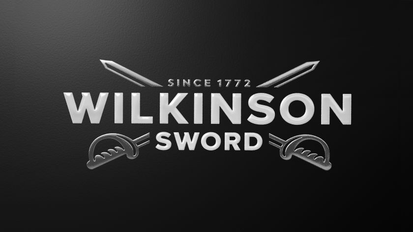
“Empowered by this positioning, we were able to rework the brand’s famous cross-swords logo, introducing greater depth and character by bringing a modern dynamism to the brand mark”, says B&B Studio co-founder and creative partner Shaun Bowen.
The new logo design ditched the previously flat and one-dimensional graphic in favour of a mark that adds greater depth and character to the swords. The logotype has also been modernised, as the Ws have been redrawn with sharp and purposeful cuts.
Early on, B&B got to work on the brand architecture, seeking to bring “meaning and purpose” to Wilkinson Sword’s portfolio through “a simplified design system to help people find the right tools for them”, Bowen explains.
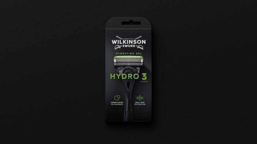
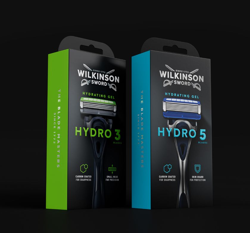
This included designing a simplified communications system that defined clearer product naming, universal benefit-led iconography, and a consistent hierarchy. Bowen says this new system “aids navigation and makes the brand’s expertise instantly accessible”.
Wilkinson Sword’s new tagline – ‘Since 1772’ – carries the message of the overall positioning, highlighting the brand’s longevity and expertise while subtly nodding to its continuing progress into the future. “The line sits snugly between the crossed swords, adding a quiet confidence to its execution,” says Bowen.
With Hydro 5, Wilkinson Sword’s highest-performing blade, B&B Studio wanted to incorporate the product name and image together on the pack to create a “contemporary standout”, according to Bowen, and so the team chose the typeface Grafical, which balances “modernity and craft”.
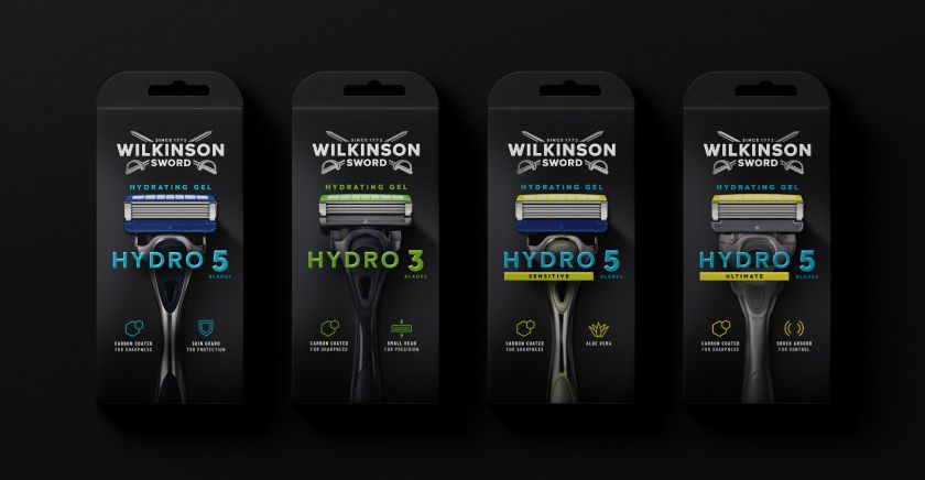
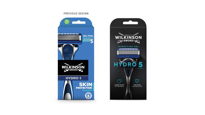
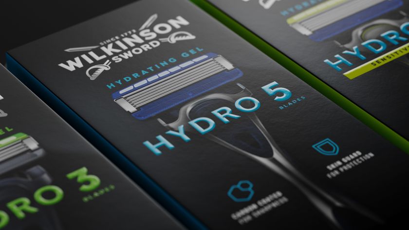
The studio and brand also made the somewhat bold decision to introduce black as a core brand colour across all ranges. Bowen says this was to create “an overarching family feel, bringing together different SKUs so that any of the products can sit together”.
Colour blocking is then used to differentiate ranges, resulting in what Bowen calls a “slick contemporary confidence that gives standout to hero product imagery and clarifies what’s inside the pack”.
He says: “The new positioning and design is a great example of the role that heritage can play when used strategically.
“The design celebrates heritage, but also shifts focus from the past to the future, creating an impactful legacy with ongoing relevance.”
Related Posts